Week 4-5: More Fabric color studies for quilters
Welcome to week four and five of my daily practice of creating a fabric color study. I’ve designed this project to expand my understanding of color within quilt design and to unlock my creativity. I’m focusing on using fabric from my scrap bins to create one 9 1/2” unfinished quilt block a day.
The next two weeks are an exploration of color interactions. Artist Josef Albers is one of the most well-known explorers of color interaction — he literally wrote the book “Interaction of Color,” published in 1963. The limited-edition book contained silkscreened color studies. He relied on a motif of a square within a square to demonstrate how the same color can look different based on the context and relation to another color.

I’ve included the project brief here again for reference. Other content from this series:
project brief
Objective: Develop a daily quilting practice designed to free up my creativity and expand my color range.
Guiding principles:
Daily - Sew a block each day.
No rulers - All fabric will be cut without the use of rulers. Rulers will only be used to square up finished blocks.
Color studies - Use Hornung’s exercises to start my color exploration but don’t be confined by them.
No judgement - No good or bad. Pretty isn’t the objective. When in doubt, see objective.
Many of the exercises in the book involve mixing colors. Because I’m using commercially available fabrics, I’ll adjust the exercises to account for this.
“[S]implify things to see them more clearly.”
Day 22-23
Color Interaction: Value Shift
Assignment: Sew two 9.5” square quilt blocks, each with a 2.5” square in the center. The background colors of the two blocks should have high contrast with each other in terms of value. The center square in both blocks should be the same fabric and should have a value that is between the two background colors.
You’re wanting to create the illusion that the center block is a different value in each block (even though it’s the same fabric).
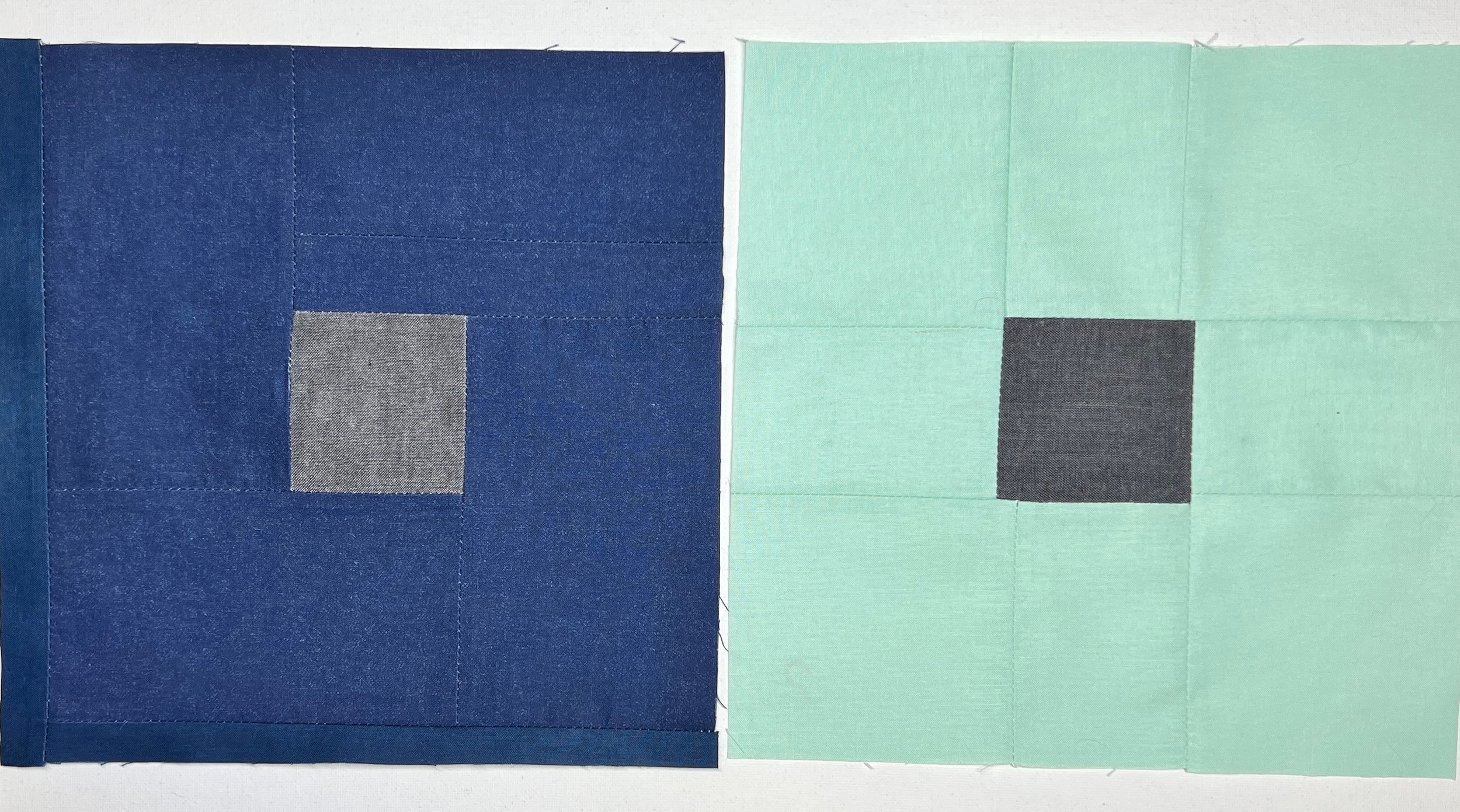
I used a gray in the center, as I felt that would make understanding and seeing the value shift easier. This is super fascinating. The interaction here makes those center squares look like completely different fabrics. There are so many possibilities here for quilters.
Day 24-25
Color Interaction: Hue Shift
Assignment: Sew two 9.5” square quilt blocks, each with a 2.5” square in the center. The background colors of the two blocks should contrast in hue but be similar in value. The center square in both blocks should be the same fabric; experiment to find a center fabric color that looks like a different hue when juxtaposed with your two background fabrics.
You’re wanting to create the illusion that the center block is a different hue in each block (even though it’s the same fabric).
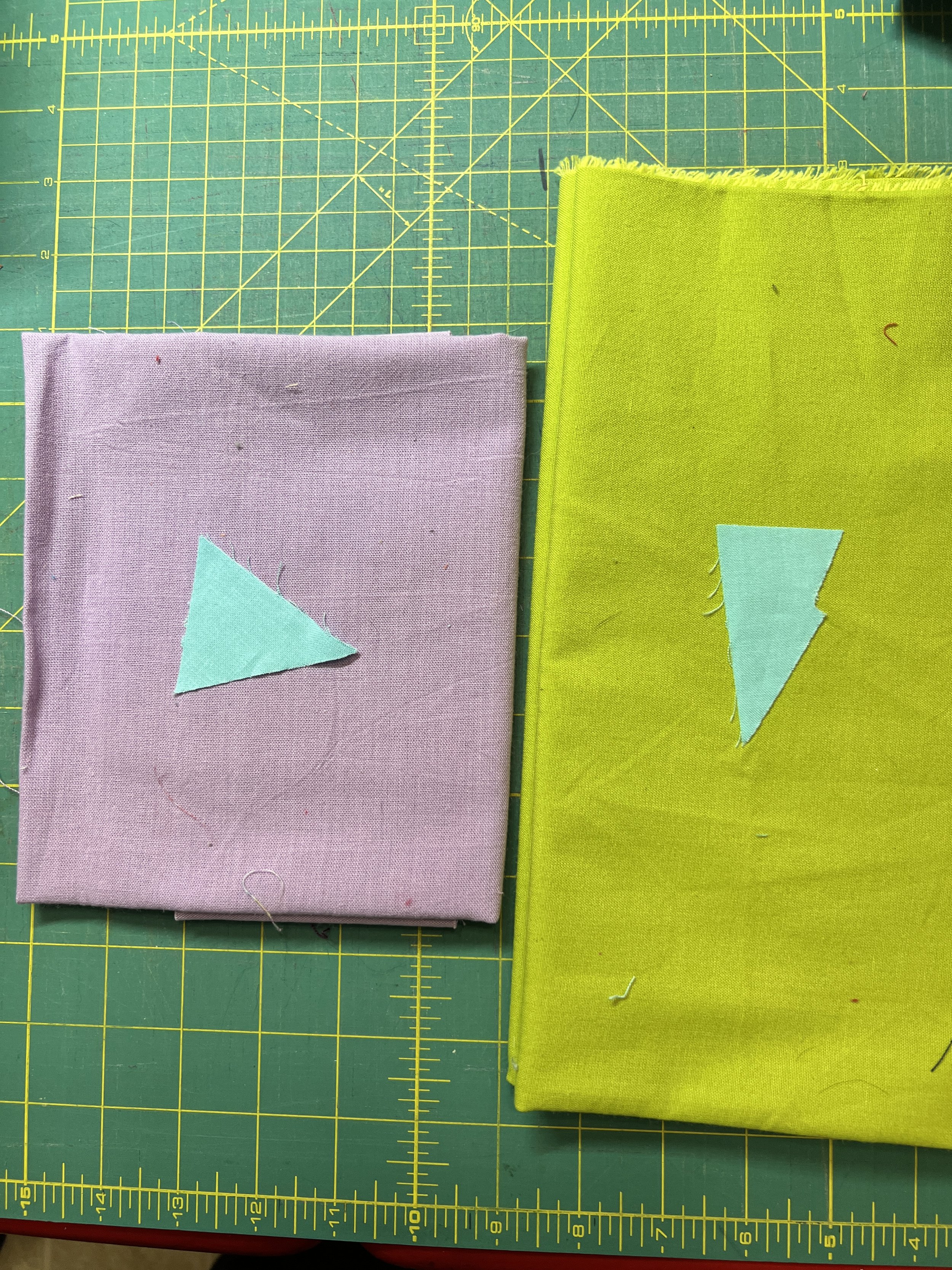
This is really hard to do with fabric. I laid out lots of different fabric combos and even sewed a set of blocks, only to realize that the color interaction didn’t work. I spent hours swapping fabrics to try to find a fabric combination that would result in a hue shift effect.
After lots of swaps, I finally landed on this color combination. I discovered that this color interaction was easier to achieve with tones. For the background fabrics, I chose two tones in complementary hues (Magenta and Green). For the center fabric, I choose a tone of Orange-Red because it is equidistance between my two background fabrics.
The Orange-Red does take on a more yellow tint with the Magenta background. With the Green background, Orange-Red does have a more orange tint. This visual effect is much easier to discern when you zoom in on the center squares. Regardless, it’s subtle.
Day 26-7
Color Interaction: Saturation Shift
Assignment: Sew two 9.5” square quilt blocks, each with a 2.5” square in the center. The background colors of the two blocks should contrast in hue but be similar in value. The center square in both blocks should be the same fabric; experiment to find a center fabric where the color appears to be more saturated against one of your background fabrics.
You’re wanting to create the illusion that the center block has a different level of saturation in each block (even though it’s the same fabric).
.
Day 28-29
Color Interaction: Hue and Value Shift
Assignment: Sew two 9.5” square quilt blocks, each with a 2.5” square in the center.
You’re wanting to create an illusion that the fabric in the center block has a different value and hue in each block (even though it’s the same fabric).
.
Day 30-31
Color Interaction: Two Hues Look the Same
Assignment: Sew two 9.5” square quilt blocks, each with a 2.5” square in the center. Here, we’re going to get tricky and use two different colors for the center block—but try to make them look like the same color. You’ll have to combine everything you’ve learned over the past few exercises to select background and center fabrics that interact to create the illusion that the center block is the hue in each block (even though it’s different fabrics).
Day 32-33
Color Interaction: Maximize brilliance
Assignment: Sew two 9.5” square blocks that use three colors twice. In each quilt block, you should use the concept of wrapping one color around another to alter each other appearance.
Day 34-35
Color Interaction: Black and white outlines
Assignment: Sew two 9.5” square blocks each with (4) smaller square units. The small square units and the background of each block should be the same in both. In one block, outline the small square units with white. In the second block, outline the small square units with black.