Week 3: More color studies for quilters
Welcome to week three of my daily practice of fabric color studies.. I’ve designed this project to expand my understanding of color within quilt design and to unlock my creativity. I’m focusing on using fabric from my scrap bins to create one 9 1/2” unfinished quilt block a day.
This week is an exploration of color proportion. Two examples of the same composition with the same colors but in differing amounts will have a different visual impact. The easiest example of this that comes to mind is the work of Andy Warhol.

“The proportional relationships in a group of colors strongly influence their overall visual effect.”
I’ve included the project brief here again for reference. Other content from this series:
project brief
Objective: Develop a daily quilting practice designed to free up my creativity and expand my color range.
Guiding principles:
Daily - Sew a block each day.
No rulers - All fabric will be cut without the use of rulers. Rulers will only be used to square up finished blocks.
Color studies - Use Hornung’s exercises to start my color exploration but don’t be confined by them.
No judgement - No good or bad. Pretty isn’t the objective. When in doubt, see objective.
Many of the exercises in the book involve mixing colors. Because I’m using commercially available fabrics, I’ll adjust the exercises to account for this.
Day 15-18
Color Proportion
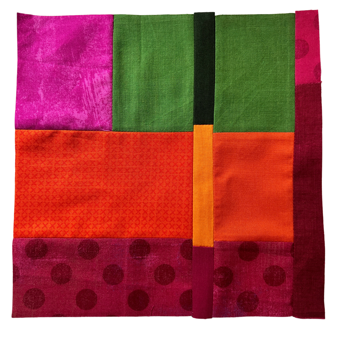
Assignment: Choose any four hues to use in the next several color studies. For each of the next 4 days, sew the same quilt block using the same colors but in different proportions.
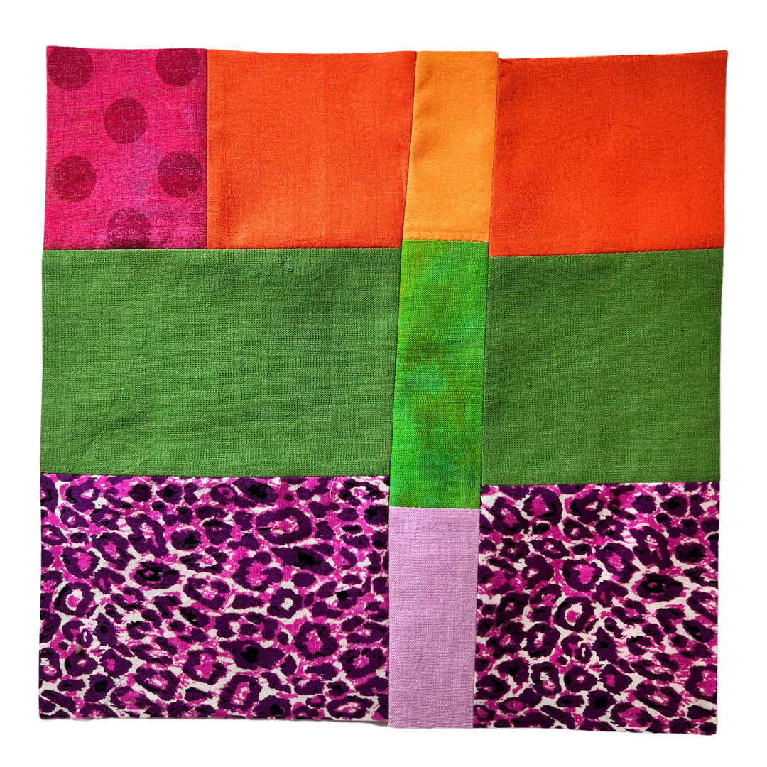
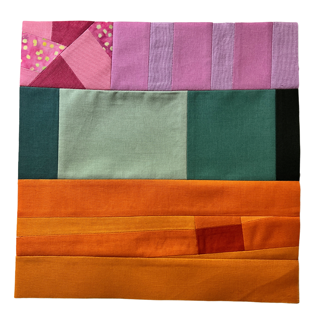
The design you choose should only use four fabrics and, ideally, has a design that has a clearly dominant color and three other colors in varying proportions. To achieve this, I designed a simple four-color quilt block.
After making the block I designed, I wanted to add a little more interest so I cut into them and added a strip (maintaining the same colors). Changing the proportion of each color definitely changes the mood of each quilt block. My eye is also drawn to different areas of the block because of the color. The fabrics with lighter value and higher saturation call my attention. The magenta and light orange pieces are where my eye goes first.
The very nature of block based quilts means that quilters are always exploring color proportion. But it’s often dictated by the pre-cut fabric bundle that we’re working with and less about conscious choices.
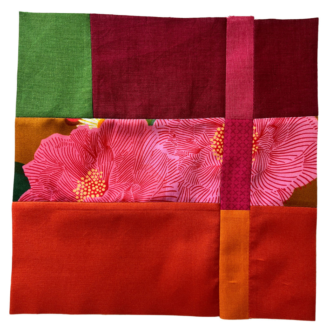
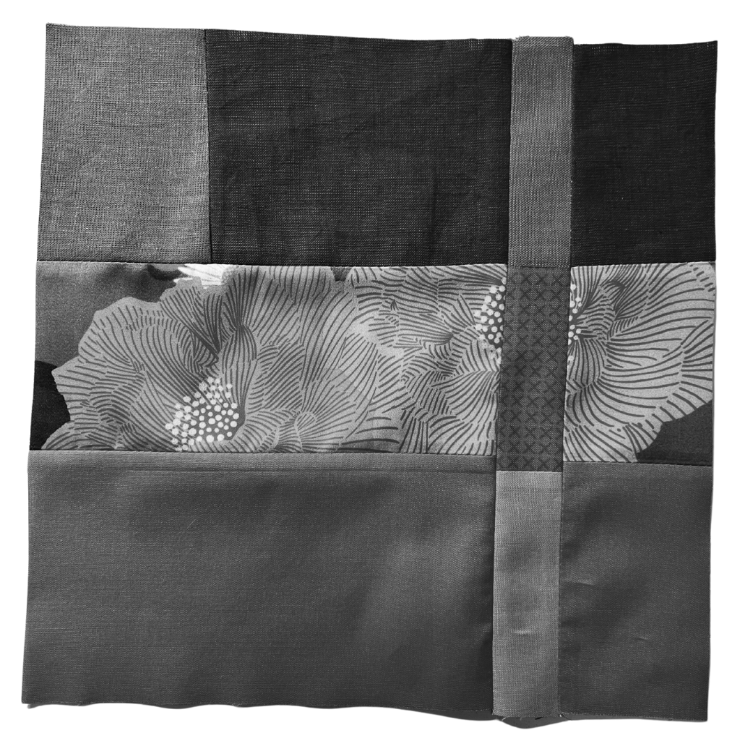
Day 19
Proportion and broad range of saturation; prismatic dominant
Assignment: Using the same four hues as the previous color studies but expand the range of saturation—from chromatic gray to prismatic. Pick a prismatic fabric for the dominant color (Fabric A, if using the block pattern above). Sew the same quilt block using these fabrics.
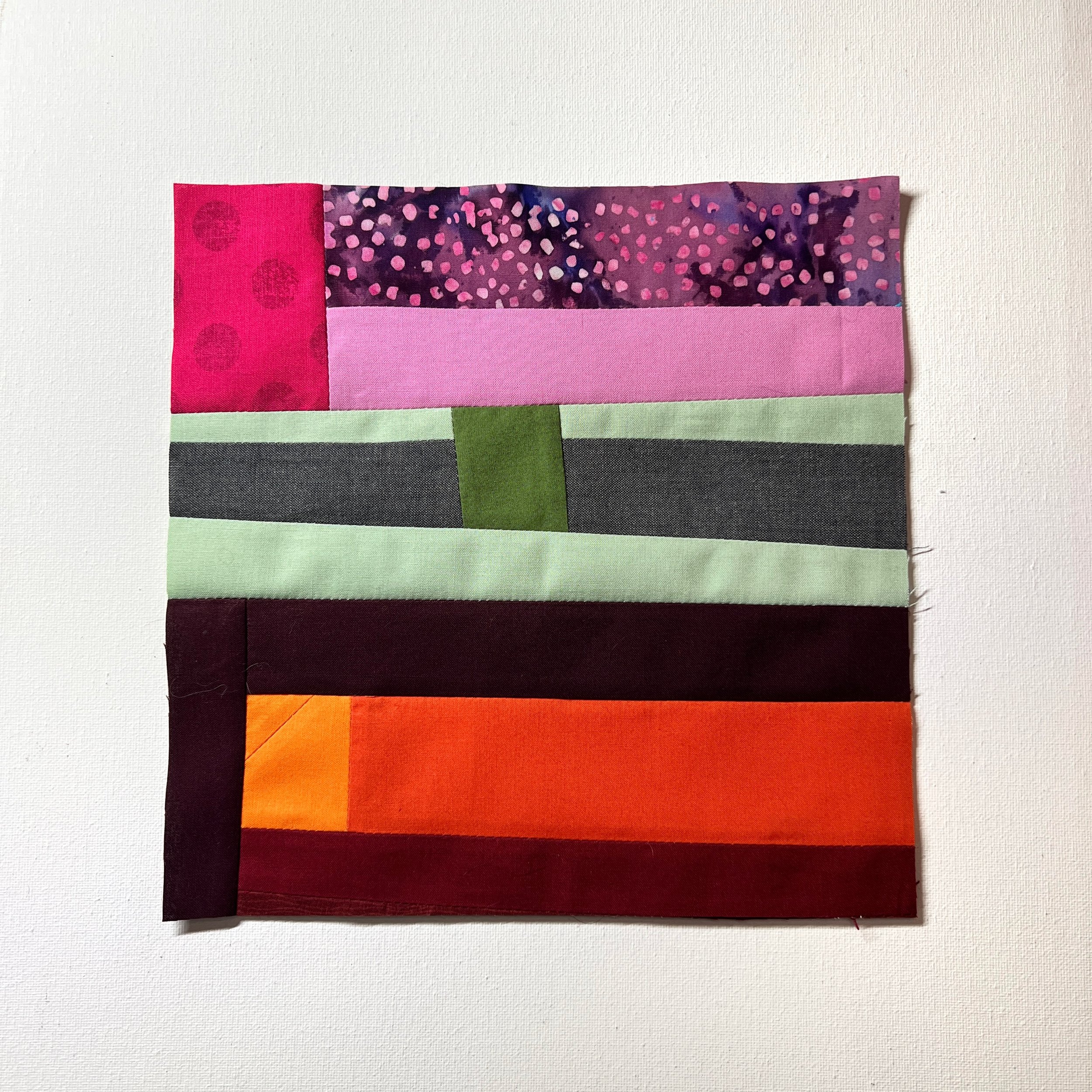
Using the same four hues as the previous color studies from the past four days, I sewed a similar quilt block. The difference here is I expanded the range of saturation—from prismatic to grays or tones (depending on what I could find in my scrap bins).
I choose orange-red to be my prismatic, dominant color. Reducing the saturation of the other colors makes them more harmonious to my eye—less jarring. The orange-red draws your attention but maybe not in a good way. There’s visual dissonance. My eye wonders why that saturated color is there; it doesn’t belong.
The value is pretty consistent throughout.
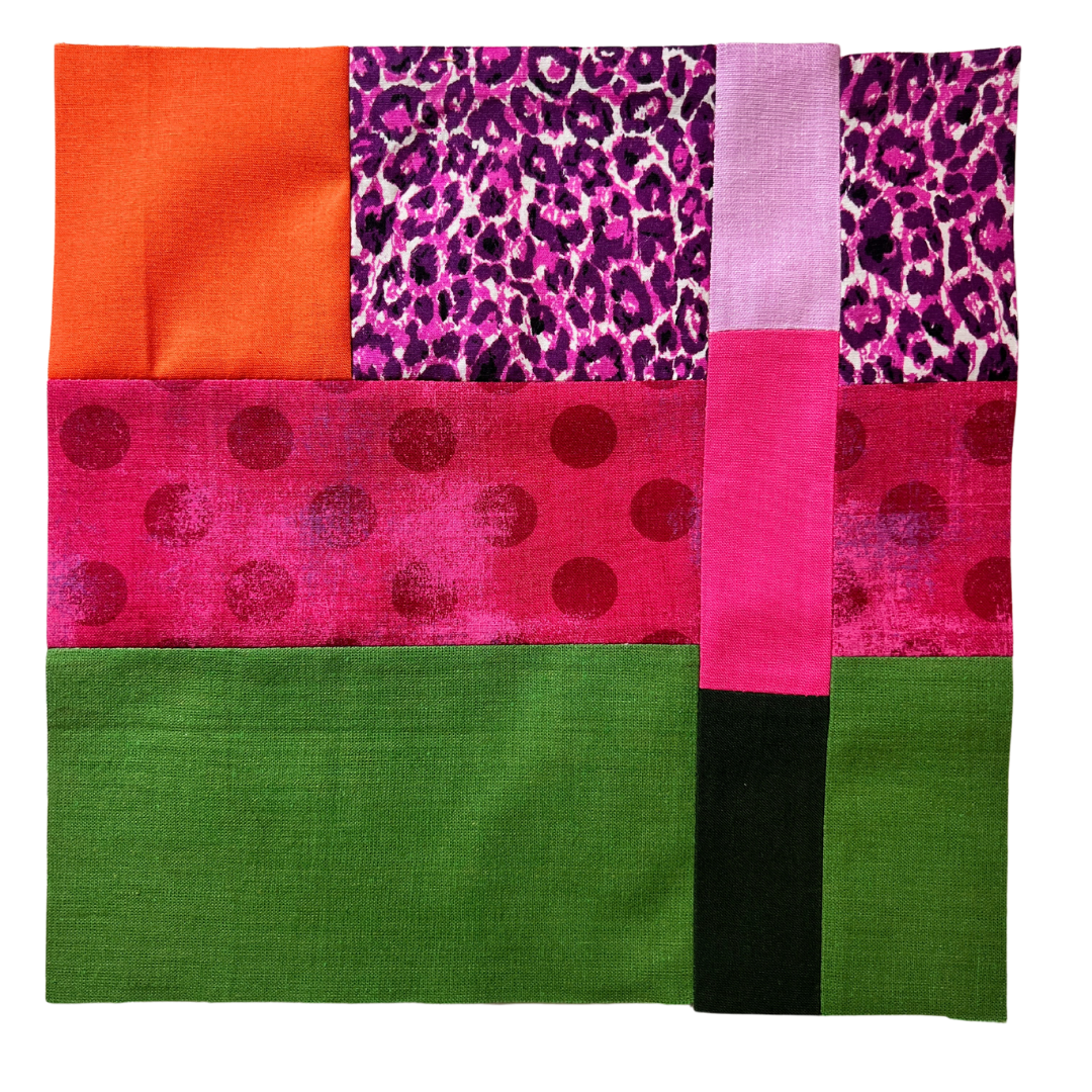
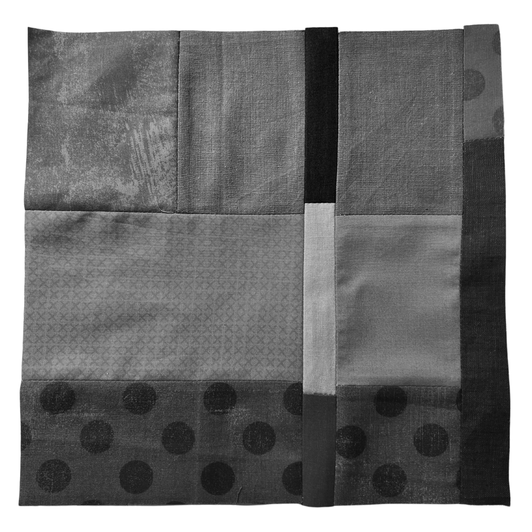
Day 20
Proportion and broad range of saturation; chromatic gray dominant
Assignment: Using the same four hues as the previous color studies but expand the range of saturation—from chromatic gray to prismatic. Pick a chromatic gray fabric for the dominant color (Fabric A, if using the block pattern above). Sew the same quilt block using these fabrics.
Because I’m working with fabrics from my scrap bins, I’m limited in what I can do. I don’t have any chromatic grays in my bins. So, I substituted tones and shades and a gray and tried to limit the amount of fully saturated fabric in the quilt block. The fully saturated orange definitely draws my eyes. The tonal fuchsia and the green tint are complementary, giving a clean line of contrast between them.
This is a very unharmonious color palette.
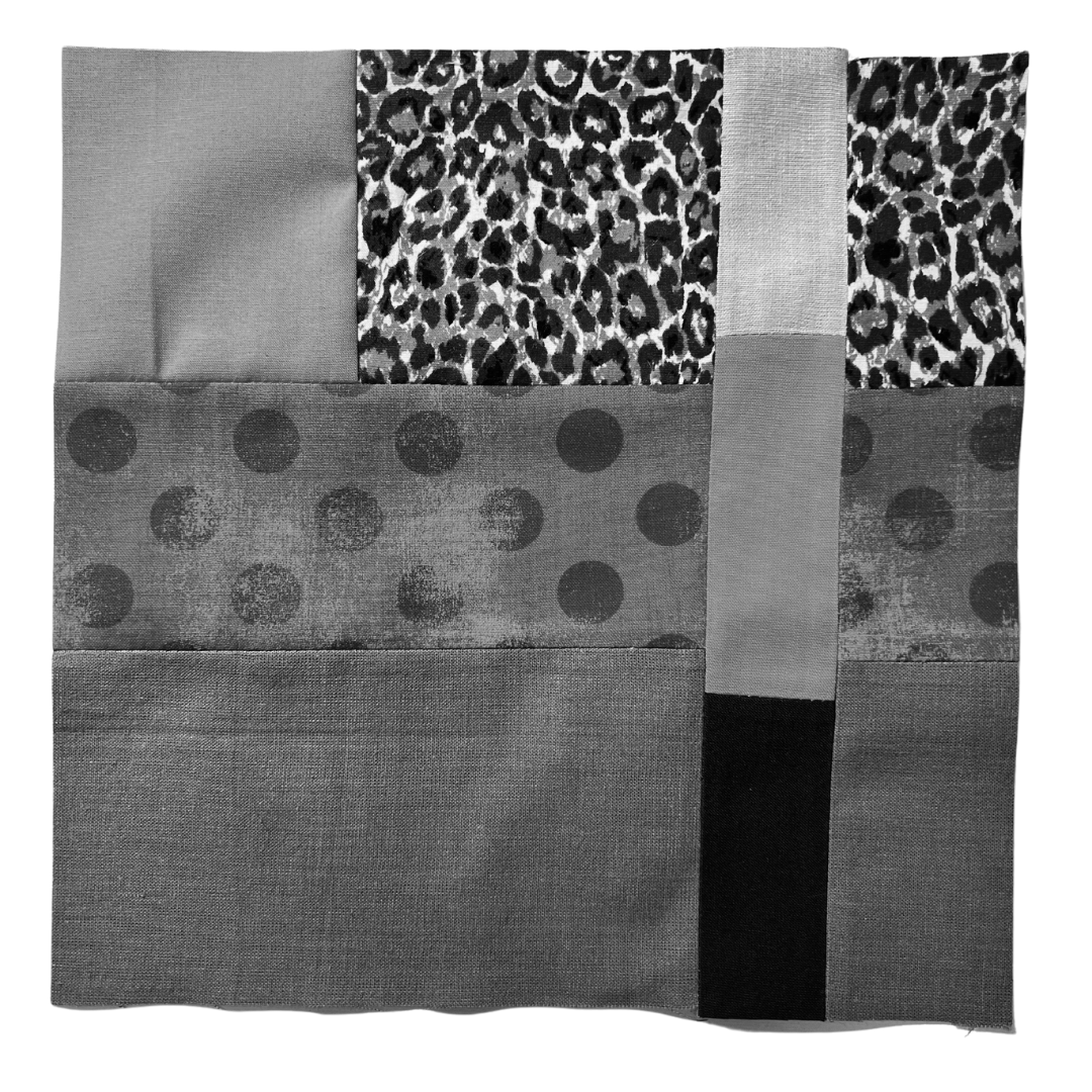
Day 21
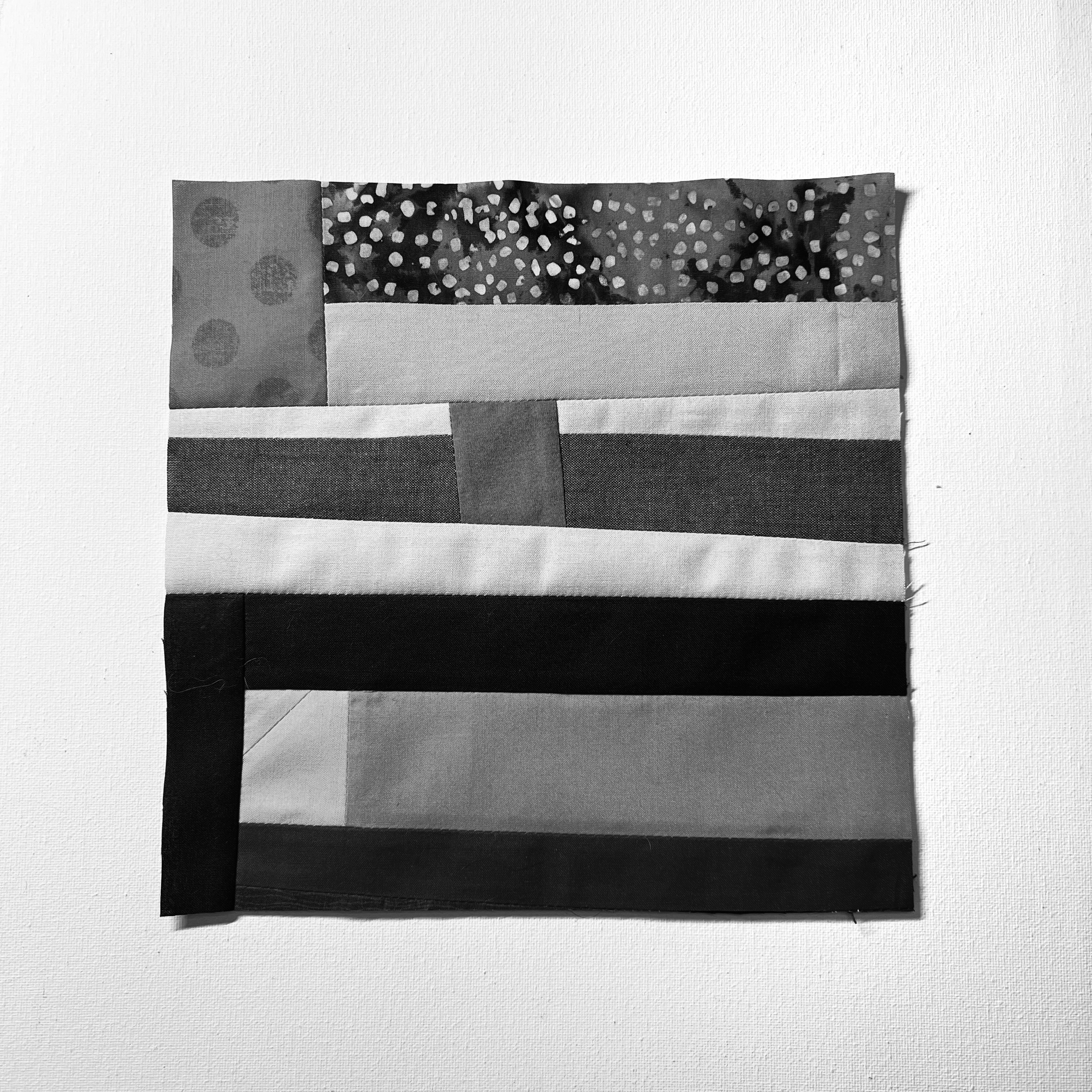
Proportion and all chromatic grays
Assignment: Using the same four hues as the previous color studies but with only chromatic grays. Sew the same quilt block using these fabrics.
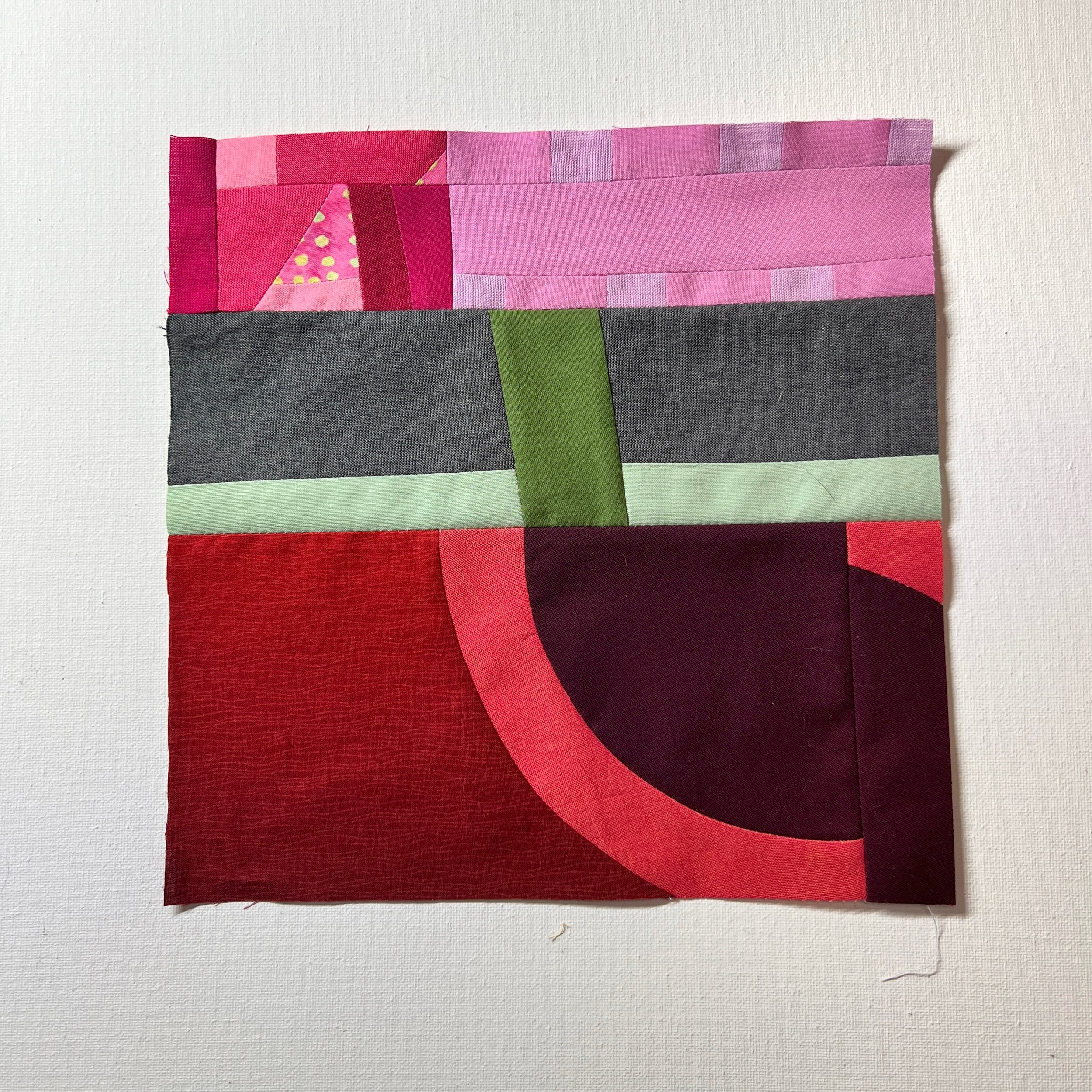
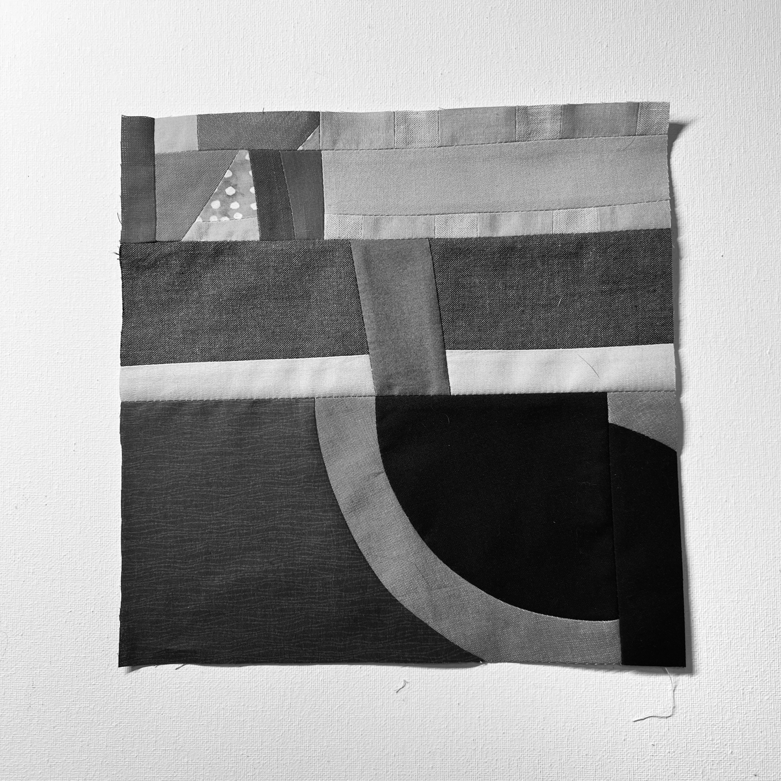
Because I don’t have any chromatic grays in my scrap bins, I substituted tones and shades. I do like the look of the gray, olive and pale fuchsia. The gray softens the composition a bit. The rosy, blue-red bits draw attention and don’t have the same feeling as the fuchsia and green.
There are parts of this composition that I find interesting. The disrupted curve and the green/gray mid-section has good balance.