Color for quilters: A series of color studies
After having finished five quilts, a pair of quilted sneakers and two group projects in eight months, I’ve found myself unsure about what to do next. I feel stuck; or, as quilters often say, “I’ve lost my sewjo.” I tried for several weeks, unsuccessfully, to excavate an idea that would get me excited to return to my sewing machine.
Recently, I picked up David Hornung’s “Color: A workshop for artists and designers.” This book is especially interesting because beyond explaining color theory concepts and how they are used, it gives the reader exercises. There are 17 assignments in the book, some are more involved than others. The goal is to increase your understanding of how we see color in order to expand your use of it.
Six chapters into the book, I had still not done one of the exercises. And, my sewjo was still missing.
While pursuing my MFA in Creative Writing, I had the chance to study with many successful, working writers. Inevitably, they were all asked a version of the same question: What advise would you give to a young writer? And, the answer was also a version of the inevitable: Write every day.
Daily practice tends to be an aspect of the approach followed by most accomplished artists. So, no sewjo shouldn’t get in the way of advancing my quilting practice. What I needed was a framework. I decided to do an exercise a day.
project brief
Objective: Develop a daily quilting practice designed to free up my creativity and expand my color range.
Guiding principles:
Daily - Sew a block each day.
No rulers - All fabric will be cut without the use of rulers. Rulers will only be used to square up finished blocks.
Color studies - Use Hornung’s exercises to start my color exploration but don’t be confined by them.
No judgement - No good or bad. Pretty isn’t the objective. When in doubt, see objective.
Many of the exercises in the book involve mixing colors. Because I’m using commercially available fabrics, I’ll adjust the exercises to account for this.

Supply List
“Color: A Workshop for Artists & Designers” by David Hornung
“Essential Color Card Deck” by Joen Wolfrom
Rotary cutter
Fabric scraps in various colors
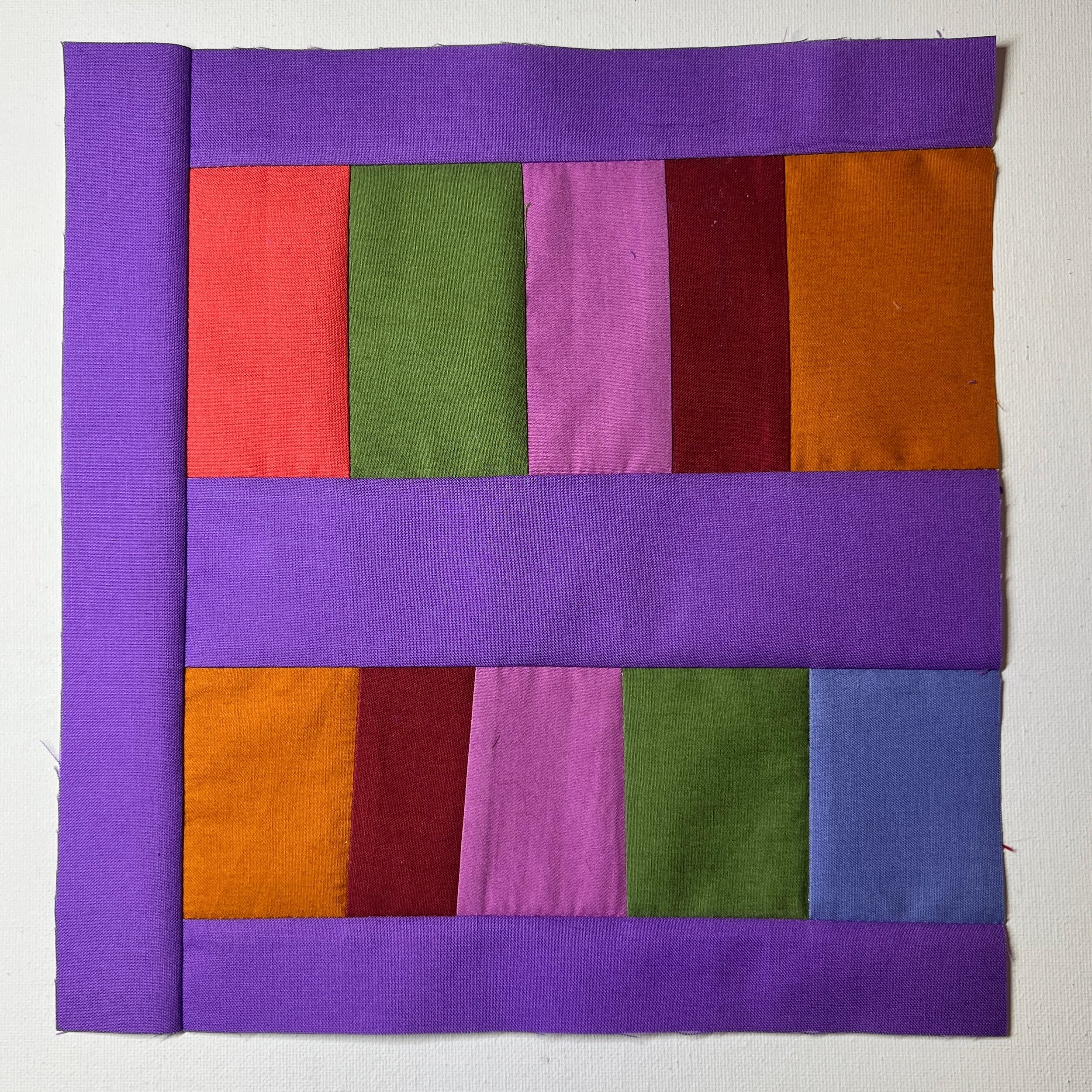
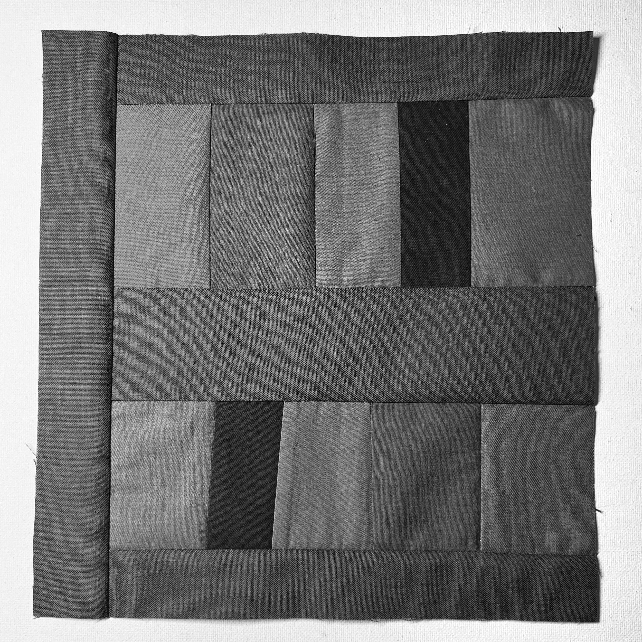
Day 1
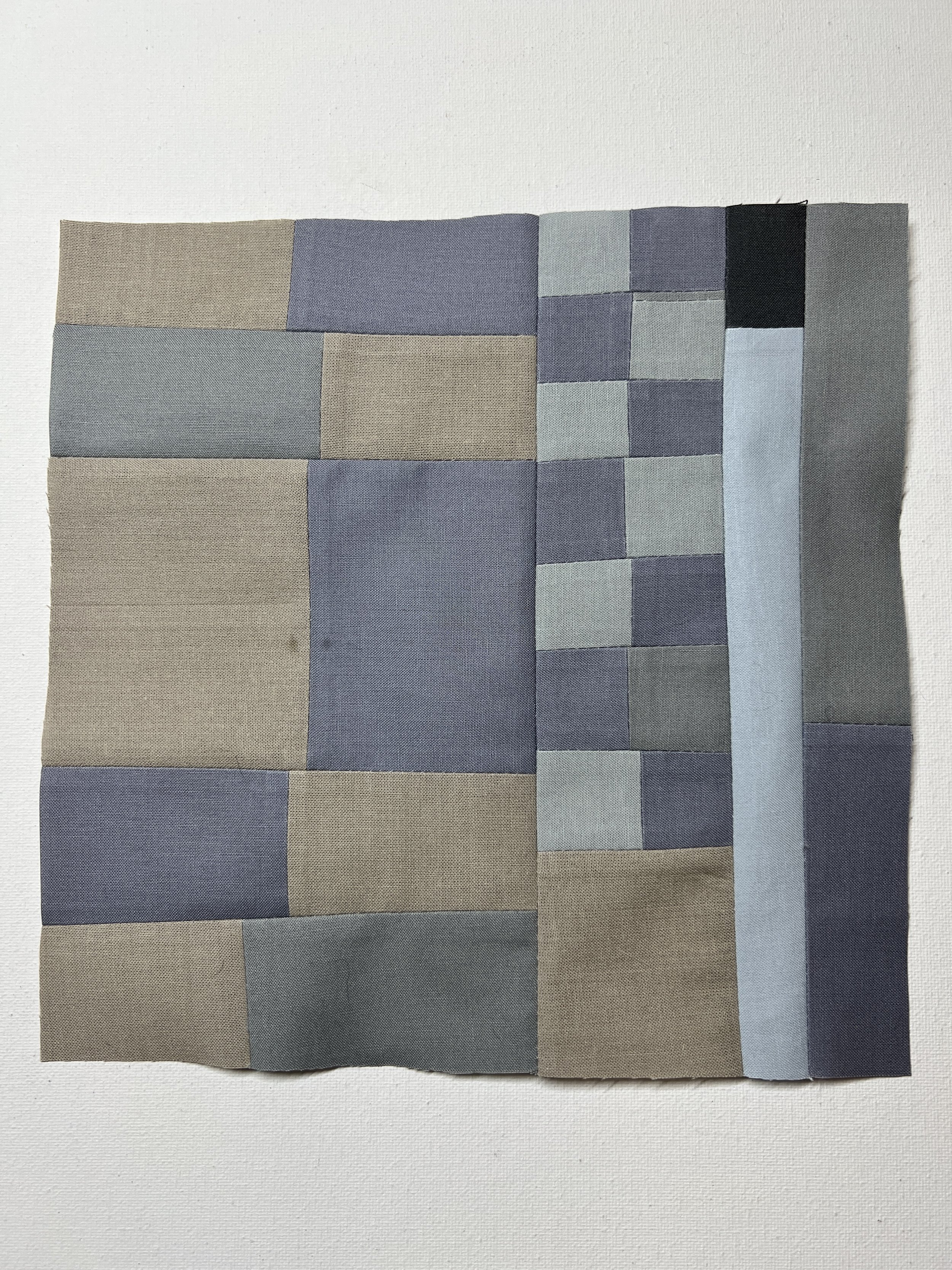
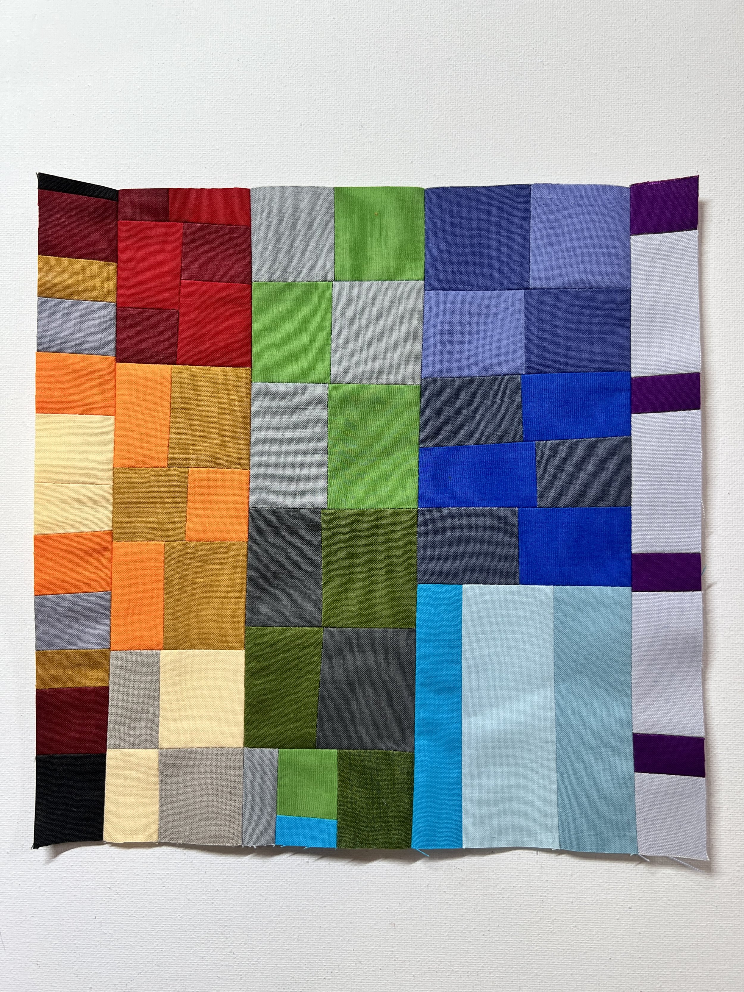
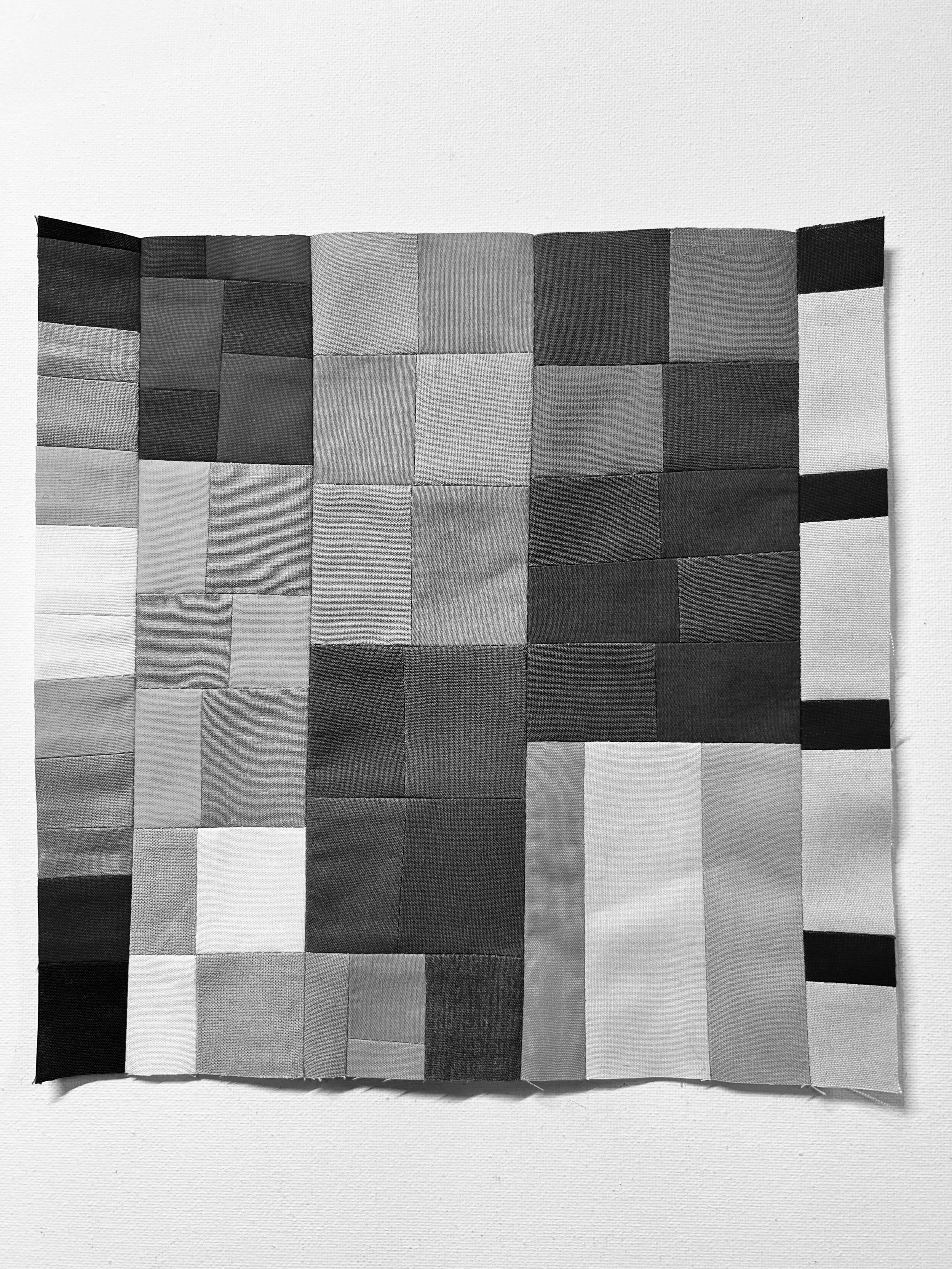
Muted Color Study: Broad Value Range.
Assignment: Using 5-6 fabrics in muted colors, sew a quilt block. The fabric colors should be muted and have a broad range of value.
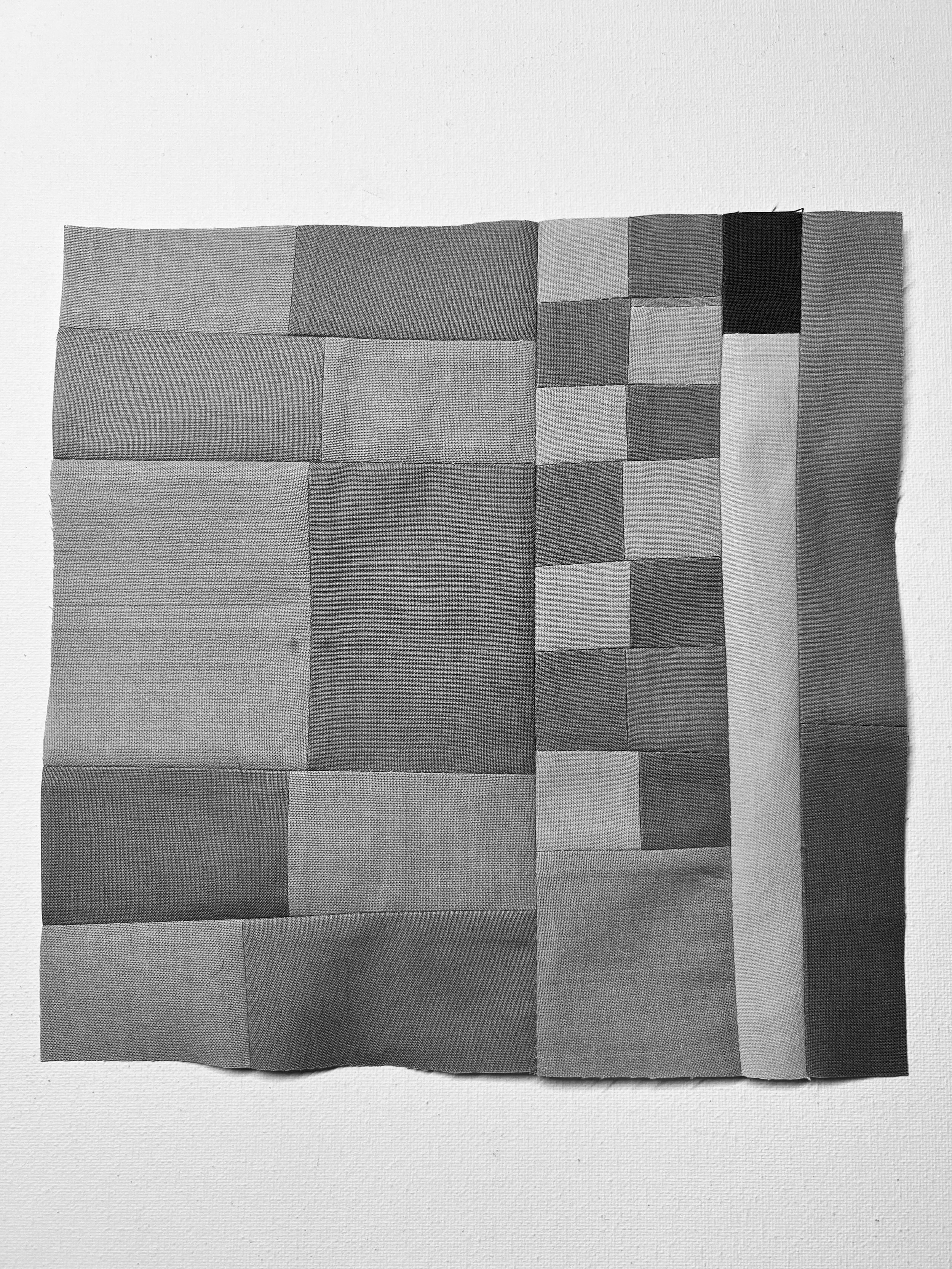
To test the values of your color choices, take a picture with your phone and convert it to grayscale (I like to use the “mono” filter on my iPhone to do this.) Reference the value scale in the Glossary of Color Theory Concepts and Terms.
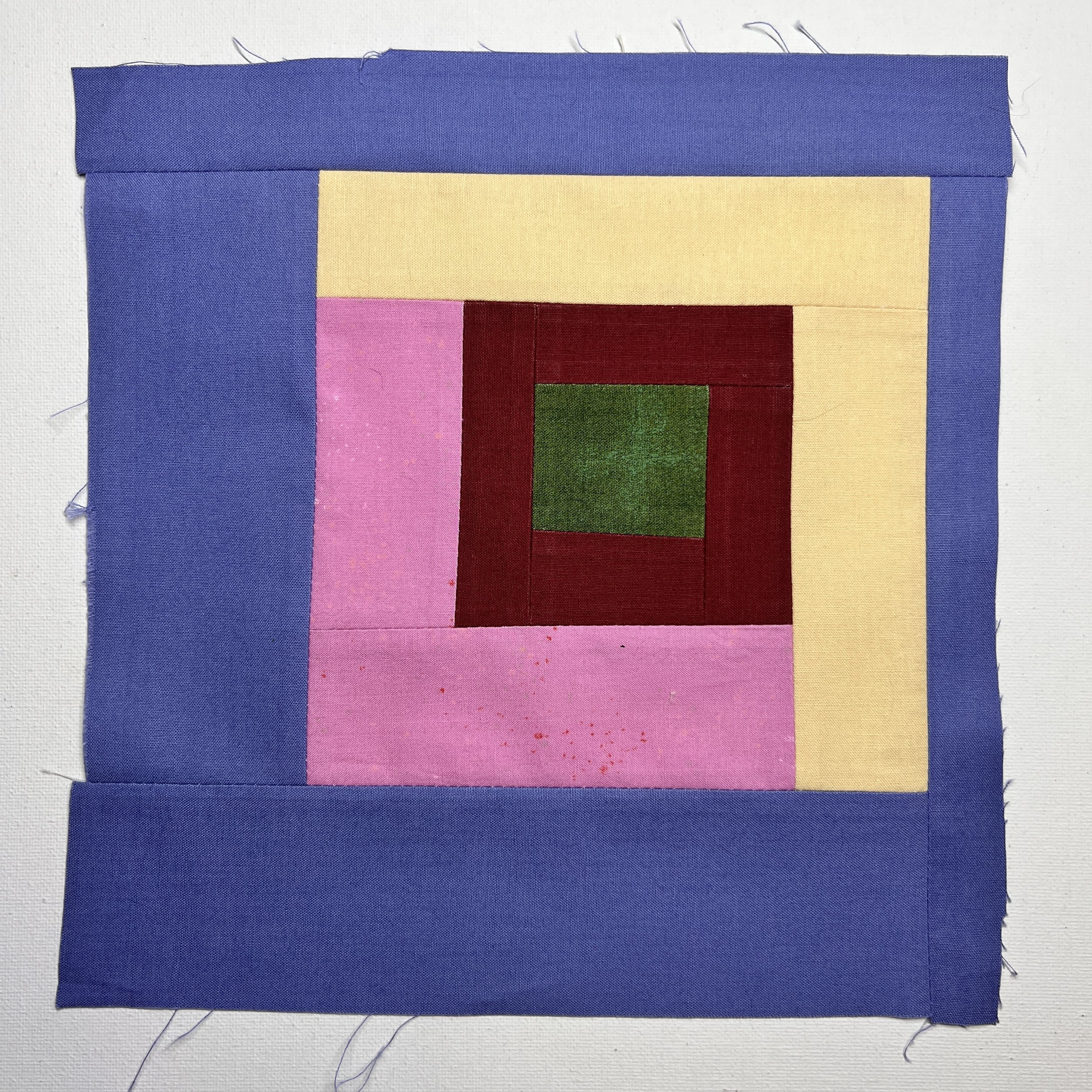
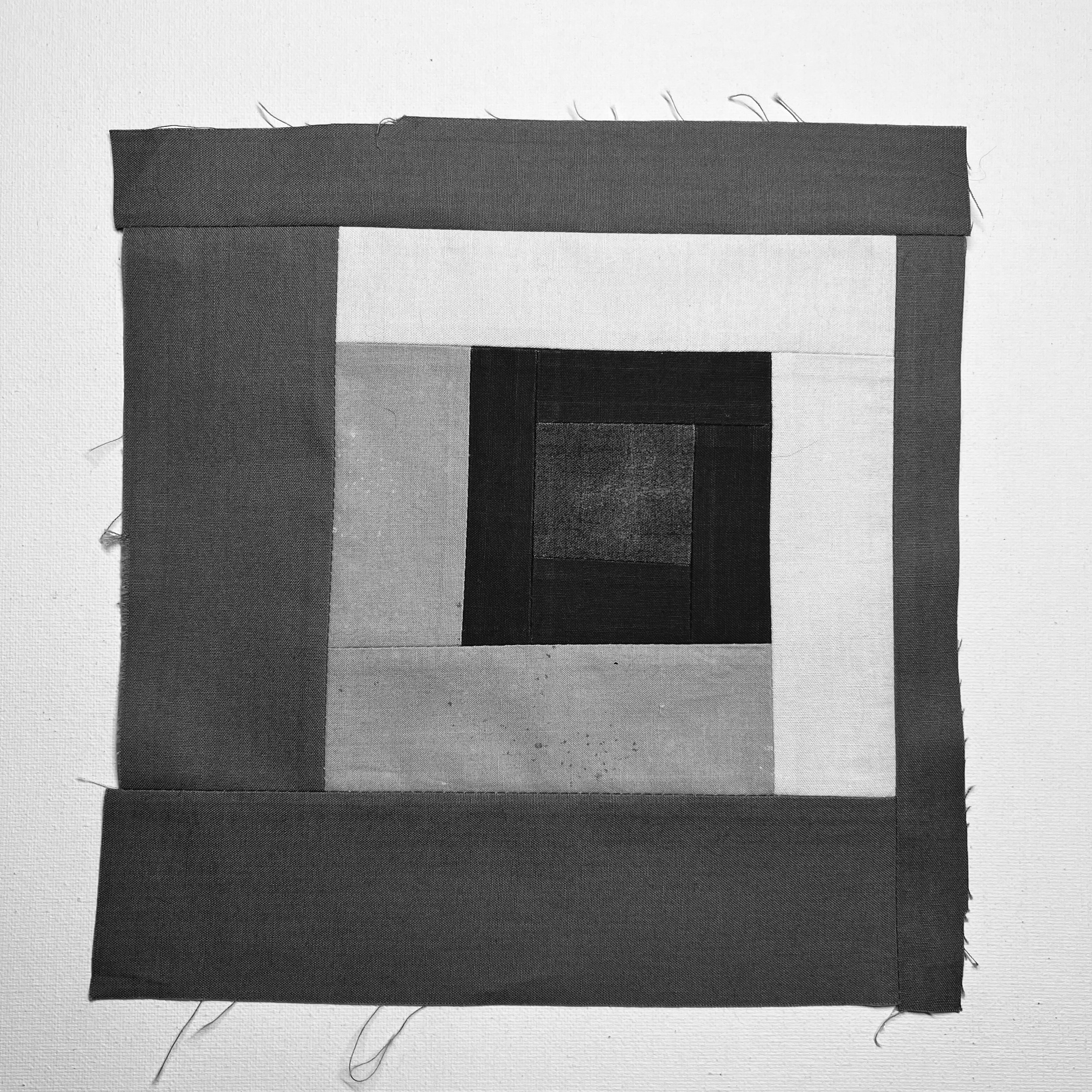
Once I was satisfied that the fabrics I pulled from my scrap bins had a broad value range, I sewed a simple log cabin block (using no ruler cutting and a more improvised style, letting the width of my fabric scraps dictate the width of my log cabin strips).
I wanted to explore these colors a little further, so I looked through my Color Card Deck and pulled the cards that most closely matched my fabrics as well as the corresponding pure color card.
The deck only includes hues and values — not desaturated colors. However, I still felt this would be a valuable step to take to expand my color practice. In the photos below, the color cards that most closely match my fabrics are on the left and the corresponding pure color cards are on the right.
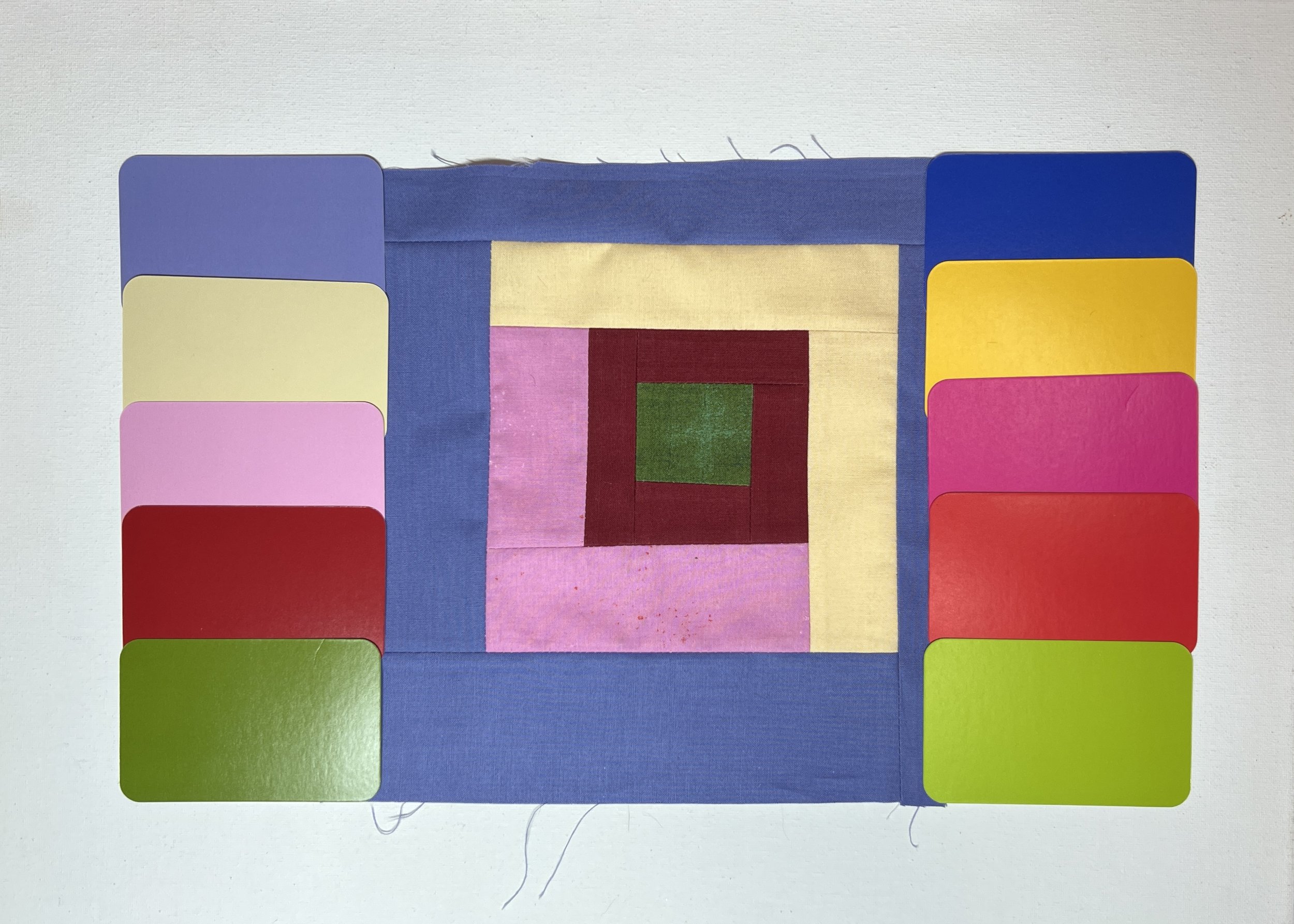
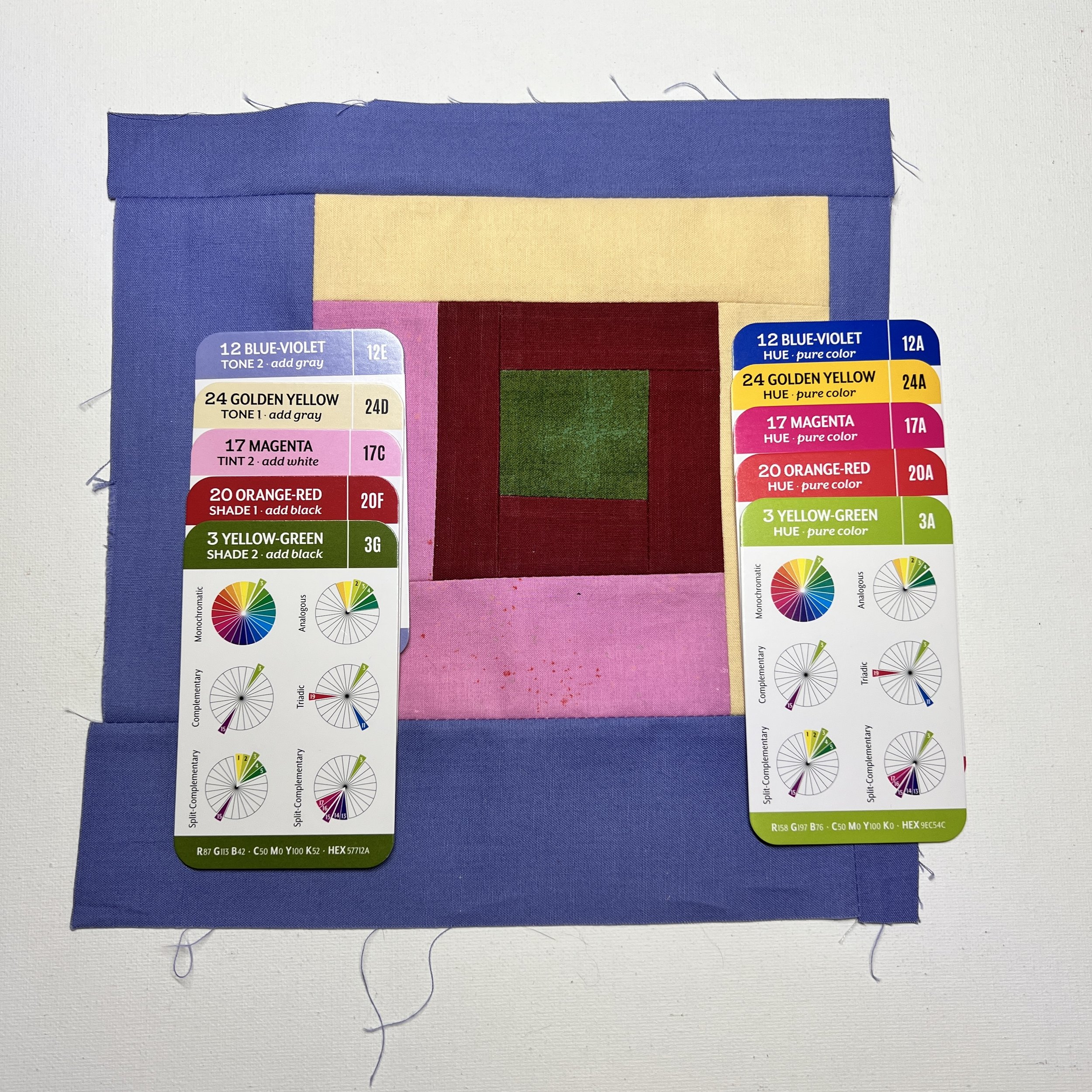
The fabrics I chose included two tones (add gray), one tint (add white) and two shades (add black). When compared to the pure colors, you can begin to see how value and saturation can significantly influence the final color.
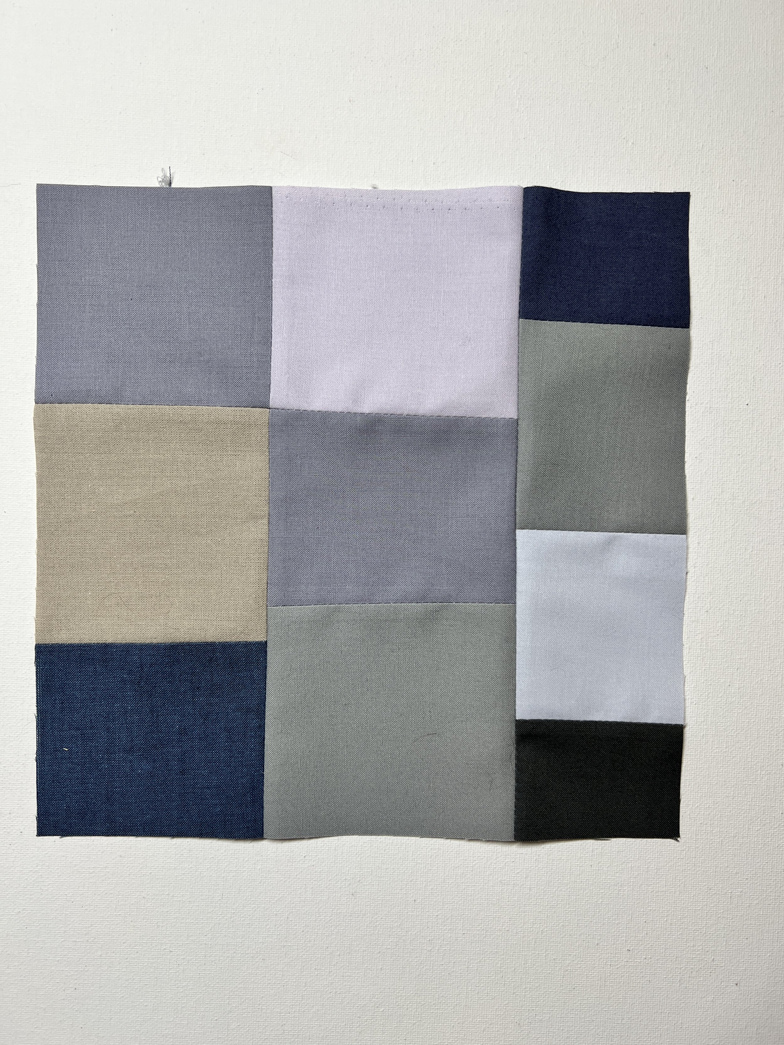
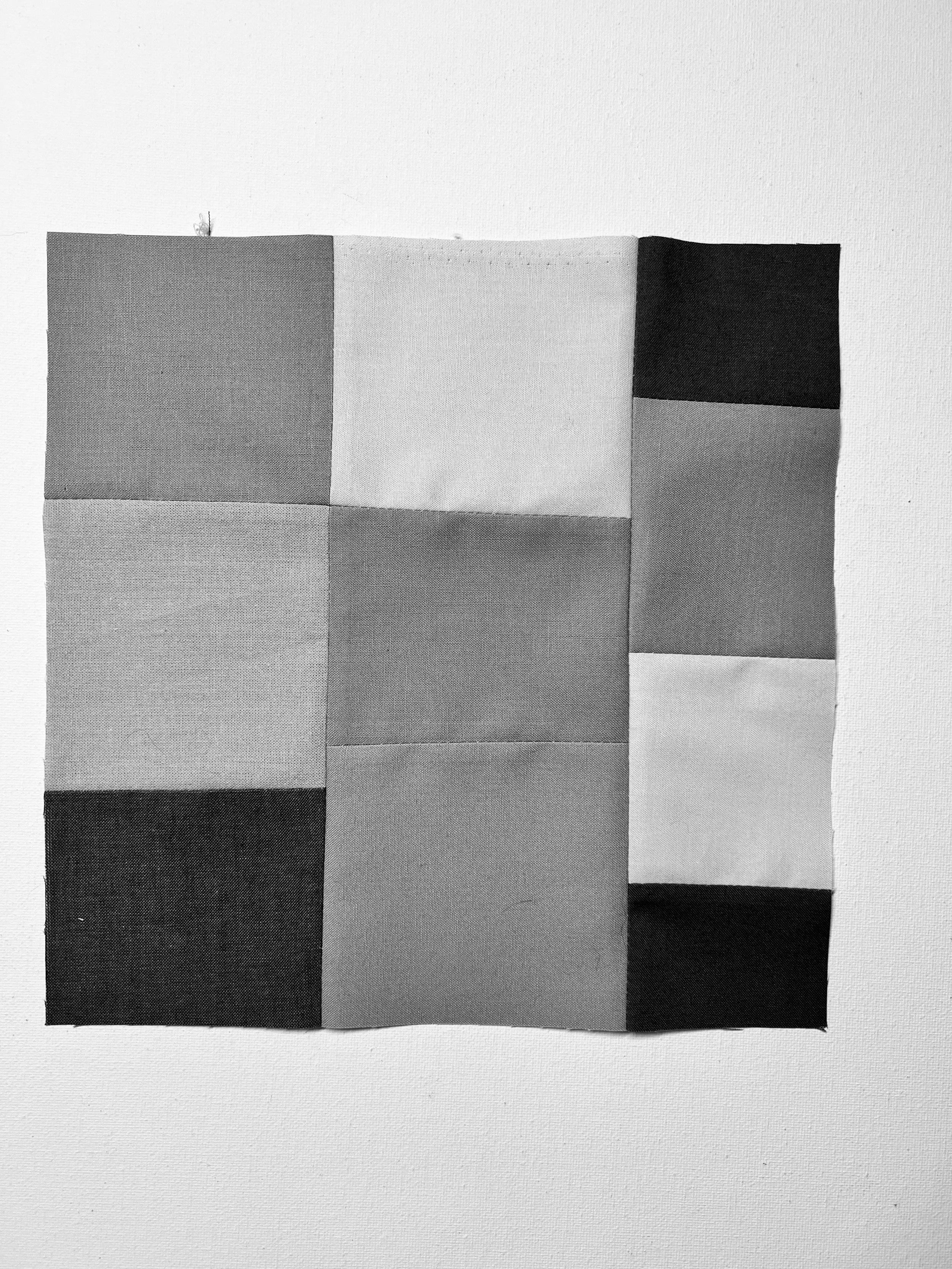
Day 2
Muted color study: Narrow value range
Assignment: Using 5-6 fabrics of muted color that are close in value (within 2 steps from each other on the grayscale), sew a quilt block.
On Day 2, I started by pulling about 10 different muted fabrics. After taking a photo and converting to grayscale, I removed the fabrics that were on the far ends of the value continuum. I did this until the only fabrics left were those close in value. I then sewed a simple strip-based block.
As on Day 1, I pulled cards from the “Essential Color Card Deck” that most closely matched my fabrics, as well as the cards for the corresponding pure colors.

The fabrics in my quilt block included five tones (add gray) and two shades (add black). When I compared the pure colors to the tones and shades, I was sometimes surprised to see what the pure color was. This was especially true with the tones. The tones seem to lose their hue identity a little more than the tints and shades. Despite that difference, the closeness of the values help to make a more cohesive color story than the Day 1 block.
Day 3
Chromatic gray study: Broad value range
Assignment: Using 5-6 fabrics of chromatic grays that inhabit a broad value range, sew a quilt block.
This assignment was challenging for a couple reasons:
I don’t have many chromatic grays in my scrap fabric bins or in my stash (hmmm.)
This exercise was really based on having the ability to mix colors; I’m working with commercially available fabric and am relying on existing colors.
Here, again, with a wide range of values, I find the combination unharmonious. This goes against all the advice you hear about pulling a fabric color scheme for a quilt. The common advice is to make sure you have a wide range of values to help with contrast. I do this myself and believe that it contributes to effective compositions. However, maybe it’s not just contrast alone that is at play.
Or maybe it’s just that I’m not used to working with solely these colors.

In the photo above, I placed the pure black and pure white color card in the center to help with comparison. I also had difficulty finding color cards that closely matched these fabrics. Some of the grays were closer to an achromatic color card, despite having a hue identity when viewed up close. A few of these grays had a greenish cast to them, but I couldn’t find a card to match. It’s interesting to note that most of these grays have a blue base. That could be because I tend to be drawn to blues when selecting fabric.
Day 4
Chromatic gray study: Narrow value range
Assignment: Using 5-6 fabrics of chromatic grays that inhabit a narrow value range, sew a quilt block.
Similar to Day 2, when there is a narrower range in value, I find the resulting quilt block to be more harmonious. There isn’t a great deal of contrast between these fabrics, but there’s enough that the design isn’t totally lost.
Day 5
Prismatic color
Assignment: Using 5-6 fabrics of prismatic color (fully-saturated color), sew a quilt block.
I’m drawn to saturated colors, so my fabric stash is filled with prismatic colors. Each pure hue has it’s own set value. Red-violet and blue have a dark value, while orange-yellow has a very light value. Spring green, aqua blue and magenta all have a value in the mid-range.
After having gone through the other exercises with the muted colors, this prismatic color scheme now feels unsophisticated to me.
“Prismatic colors are emphatic, like the crisp blast of a trumpet. Compared to muted colors and chromatic grays, they are also inflexible. Both muted colors and chromatic grays offer the possibility of great variation.”

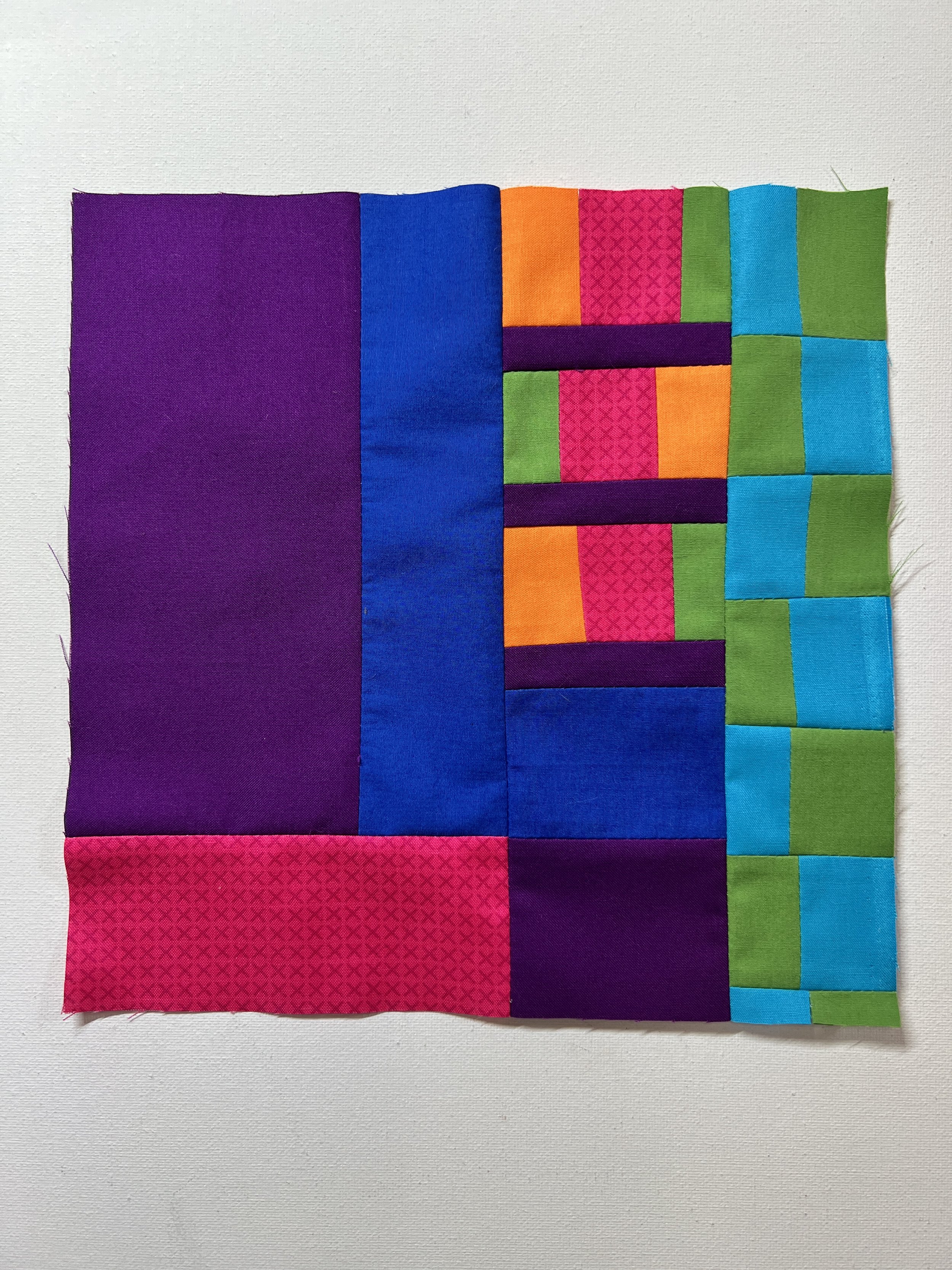
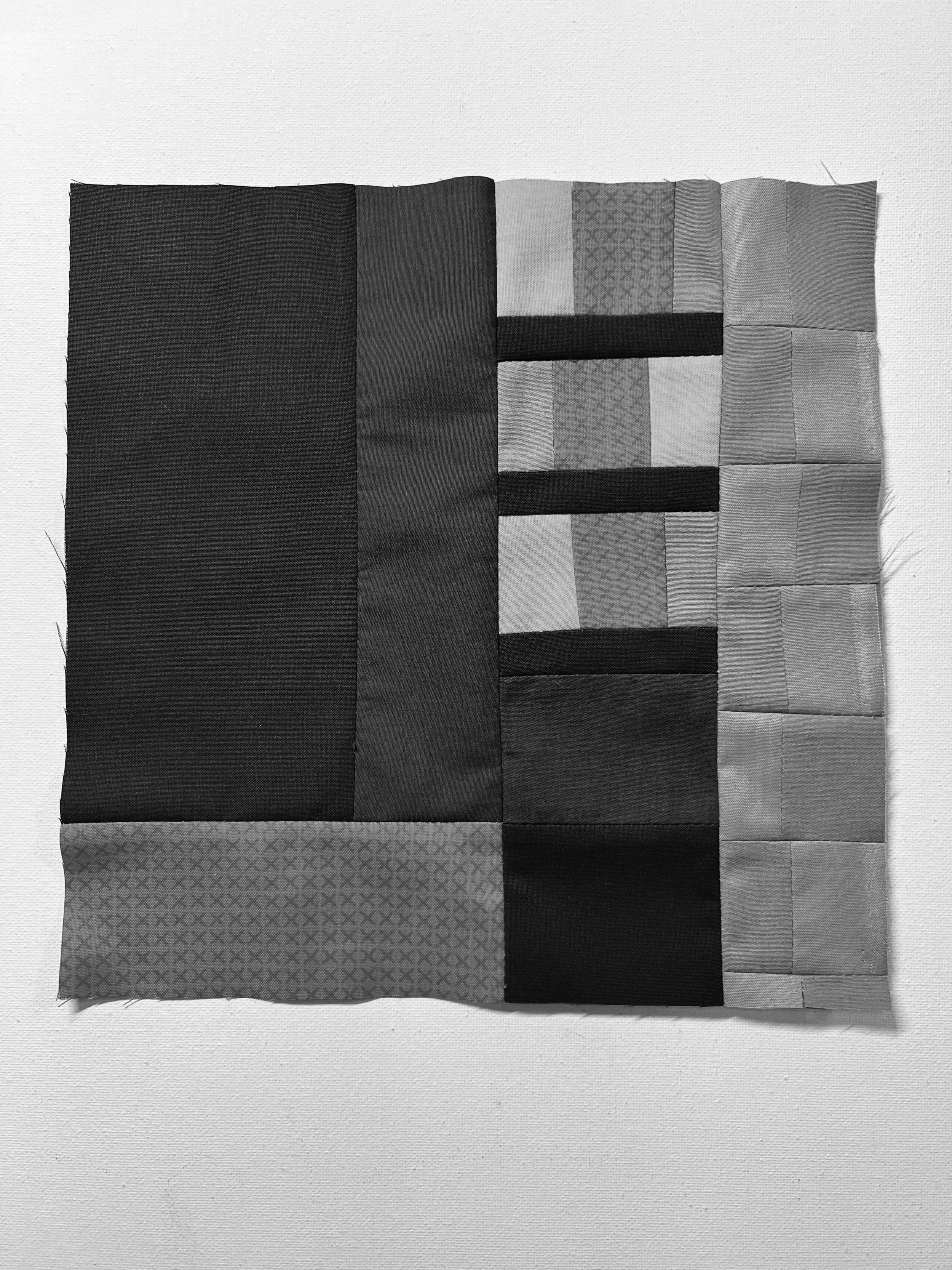
Day 6
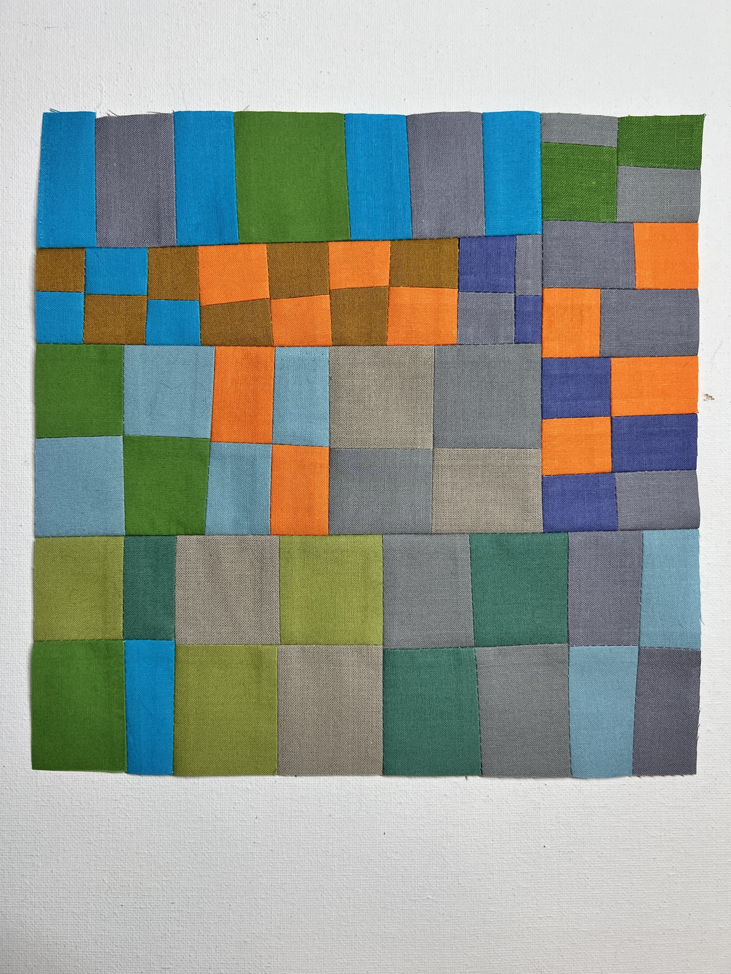
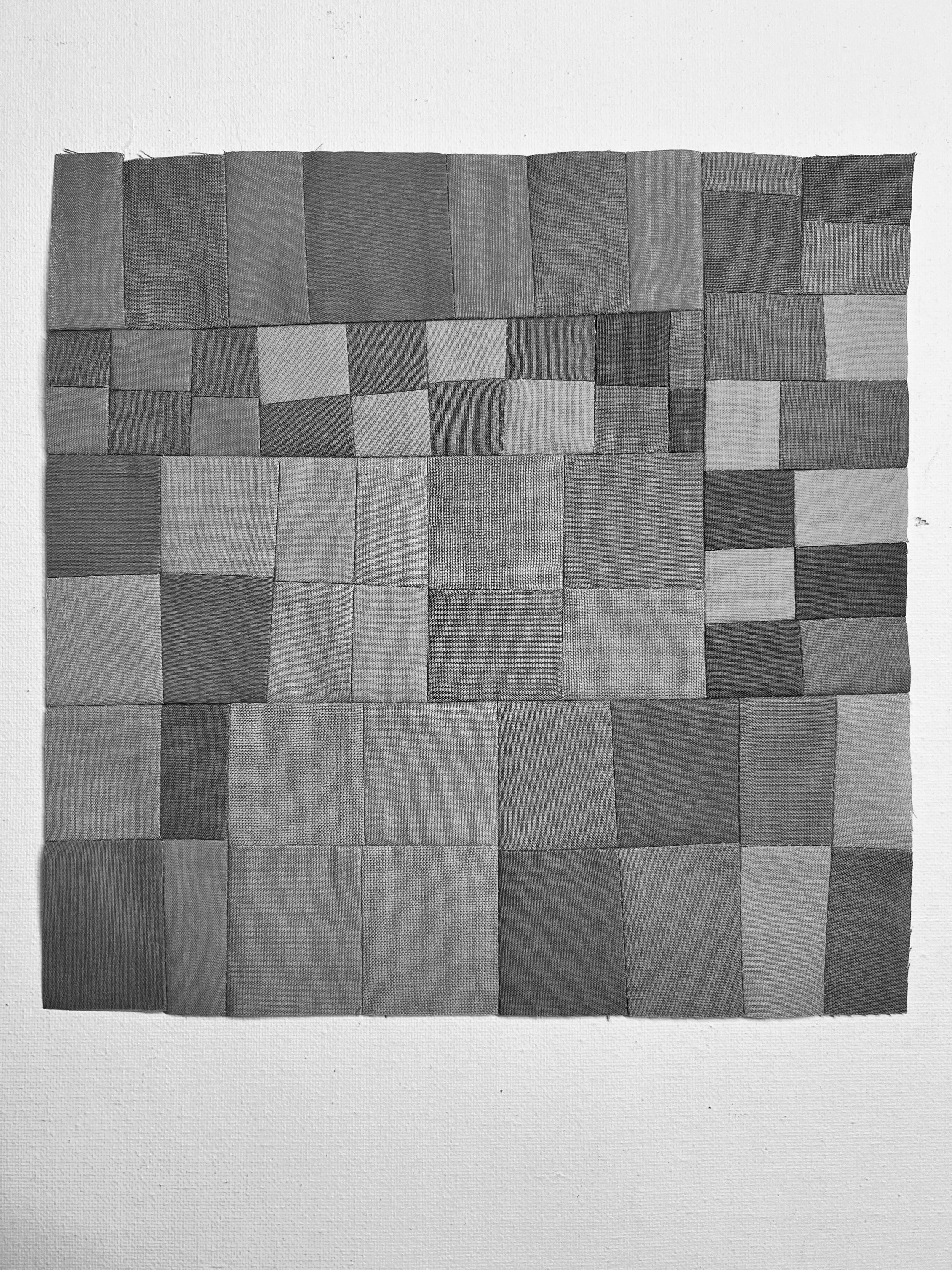
Combined saturation levels; broad value range
Assignment: Using 5-6 fabrics representing all three levels of saturation: prismatic, muted colors, chromatic grays; be sure a broad value range is represented; sew a quilt block.
This is, by far, my favorite color study. Combining various saturation levels and values provides so much depth and interest. By including muted colors and grays, the prismatic colors really shine. It’s also much easier to discern the hue identity in the chromatics grays when they are juxtaposed with a hue.

Day 7
Combined saturation levels; narrow value range
Assignment: Using 5-6 fabrics representing all three levels of saturation: prismatic, muted colors, chromatic grays; be sure a narrow value range is represented; sew a quilt block.
Like the other color studies, I created this block using fabric from my scrap bins. That means, I didn’t plan the color choices beyond just trying to find fabrics that fit the assignment: Narrow the value range but keeping a broad range of saturation levels. I do think this kind of color scheme could be interesting if you had fewer fully saturated hues. Orange, blue and green in the saturation and value levels here wouldn’t be a palette that I would choose.
It is interesting to see how saturation can provide contrast in the same way we look to value to provide contrast.
I did use a ruler to straighten edges on some of my subunits in order to construct this block. I’m going to make an effort not to rely on the ruler going forward.