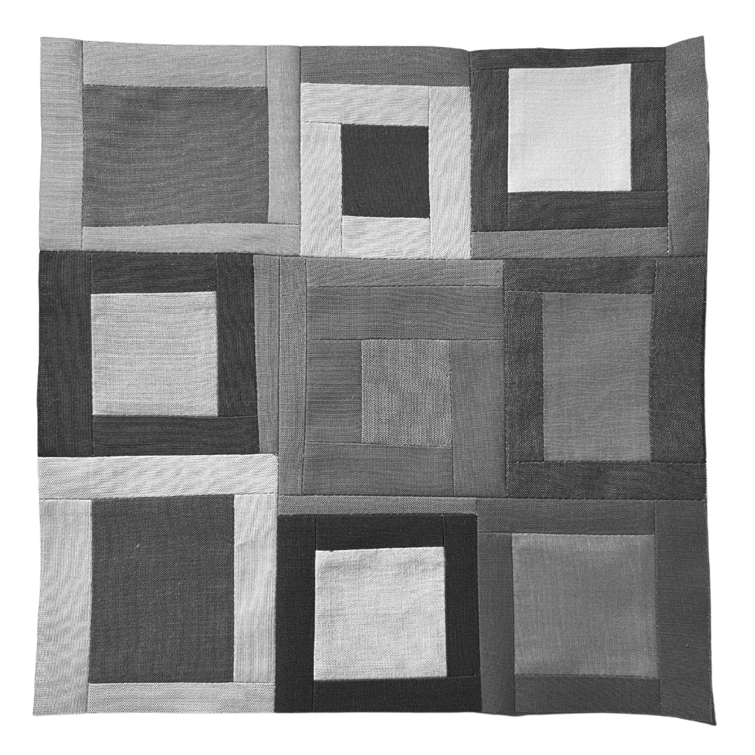
More color studies for quilters
Welcome to week two of my daily practices of fabric color studies. I’ve designed this project to expand my understanding of color within quilt design and to unlock my creativity. I’m focusing on using fabric from my scrap bin to create one 9 1/2” unfinished quilt block a day.
This week is all about color schemes. Sometimes color scheme is used interchangeably with color harmony. Color scheme is any combination of colors; however a color harmony, as the name implies, refers to color combinations that are visually pleasing (a.k.a. harmonious).
I’ve included the project brief here again for reference. You can find an explanation of how I developed this project in the introduction to Week 1. I’ve also created a handy glossary of color theory terms and concepts.
project brief
Objective: Develop a daily quilting practice designed to free up my creativity and expand my color range.
Guiding principles:
Daily - Sew a block each day.
No rulers - All fabric will be cut without the use of rulers. Rulers will only be used to square up finished blocks.
Color studies - Use Hornung’s exercises to start my color exploration but don’t be confined by them.
No judgement - No good or bad. Pretty isn’t the objective. When in doubt, see objective.
Many of the exercises in the book involve mixing colors. Because I’m using commercially available fabrics, I’ll adjust the exercises to account for this.
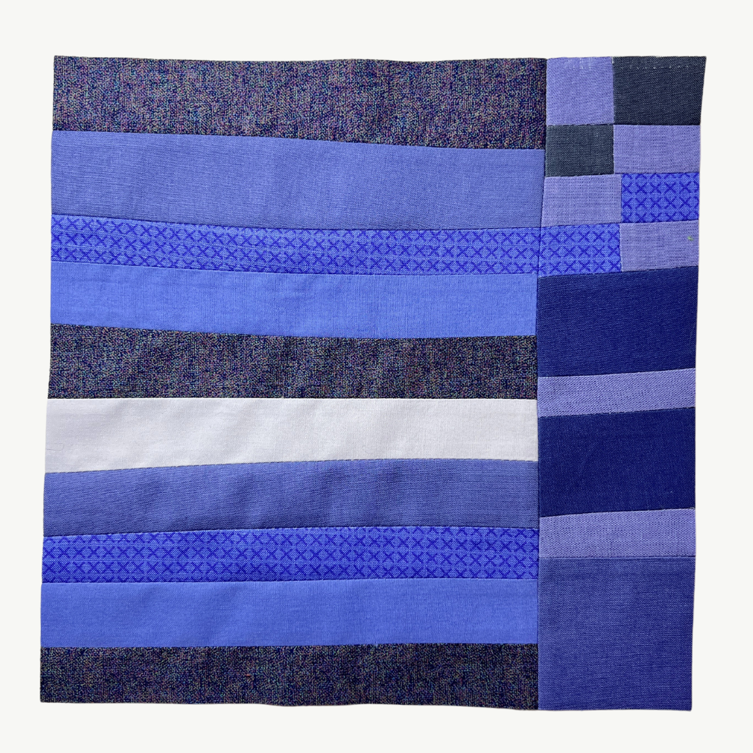
Day 8
Monochromatic Color Scheme
Assignment: Choose one hue for your color scheme. Using fabrics consisting of tonal variations of your chosen hue, sew a quilt block.

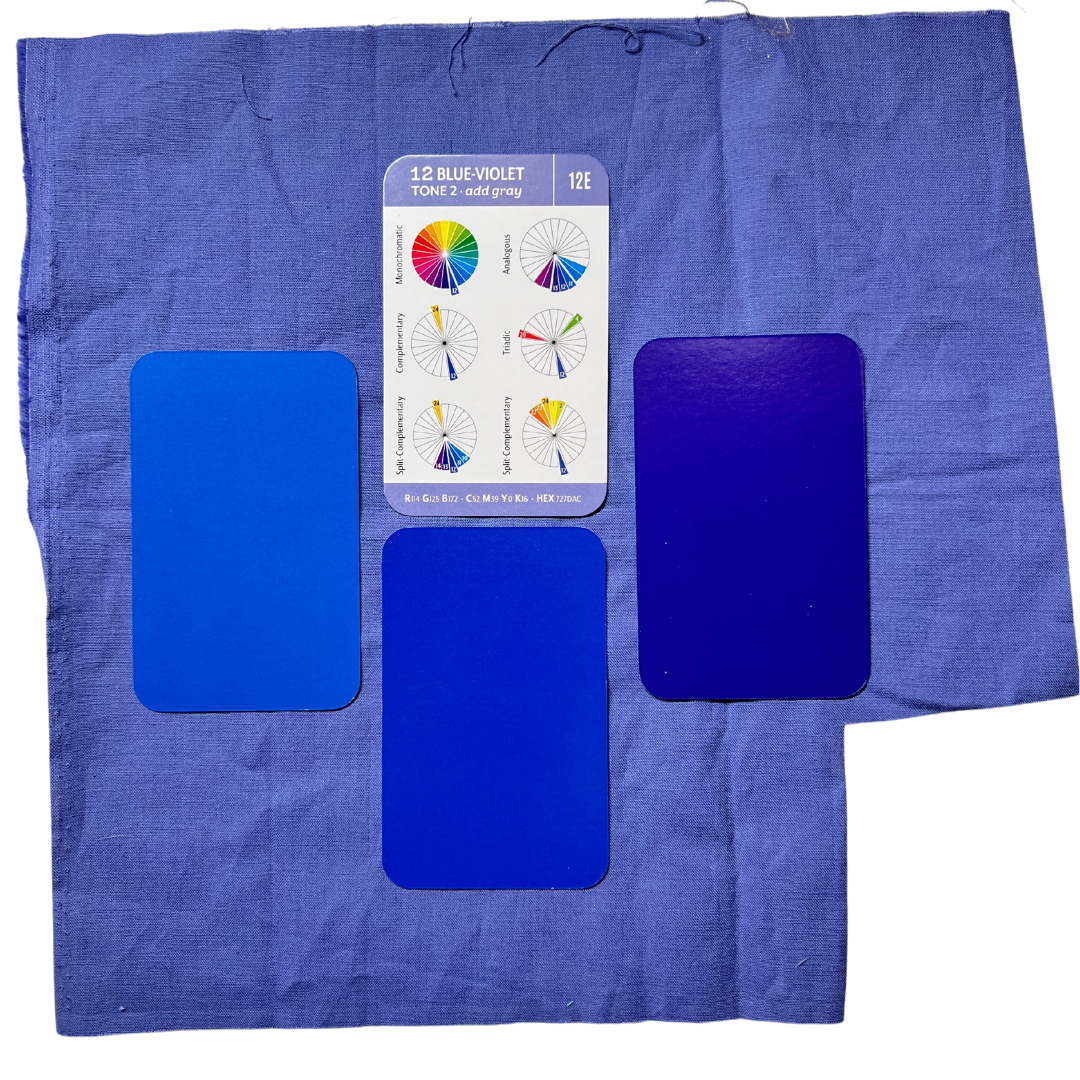
When I looked at my scrap bins, it was obvious that I used certain colors frequently. I have lots of different pinks and magentas and lots of aqua-blues, but I wanted to stretch out a bit. So, I landed with blue-violet. I managed to find several different values and saturation levels of the hue.
I’m not putting much thought into the composition of the blocks. I’m focused on the colors and how they interact. My eye is attracted to the areas that have greater contrast in value.
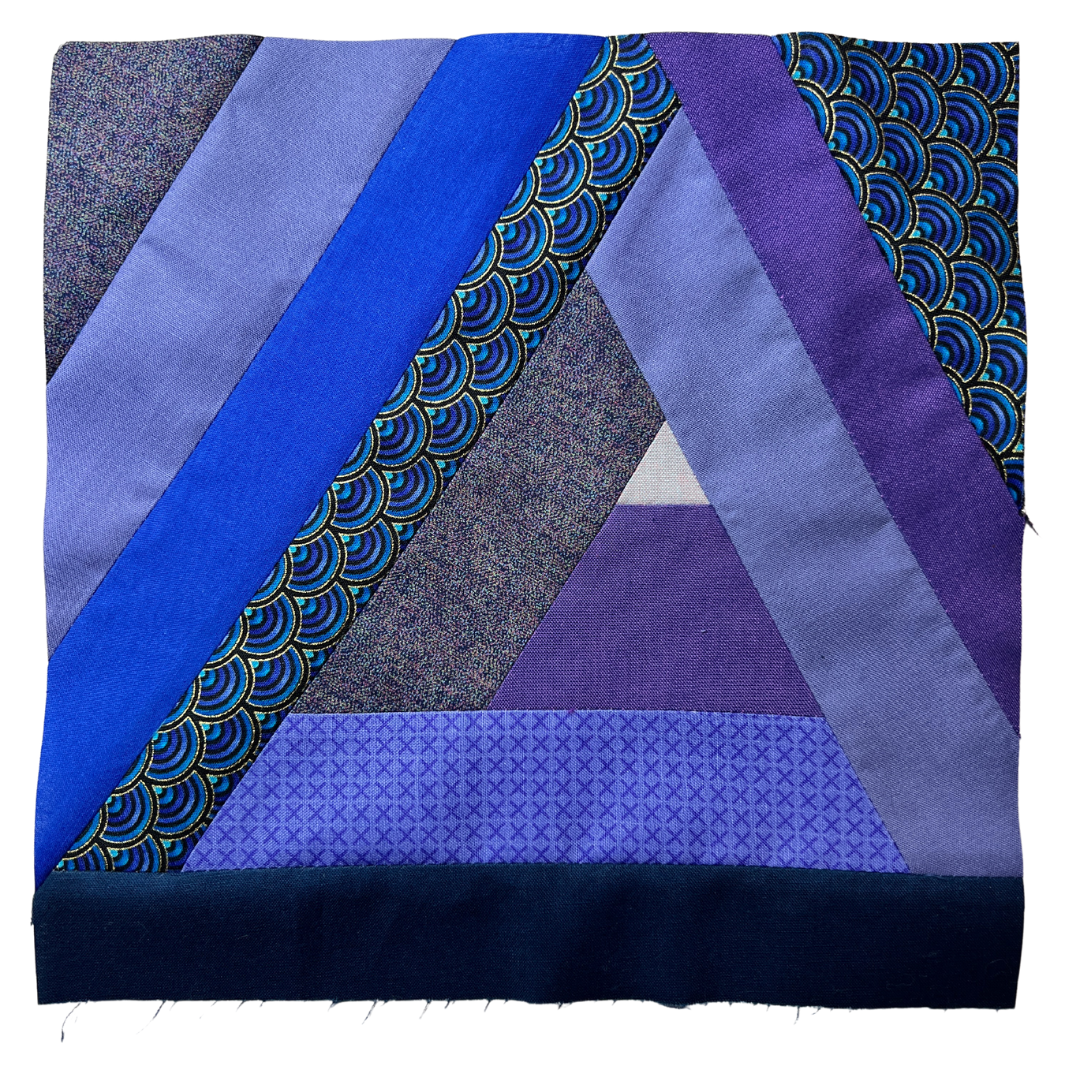
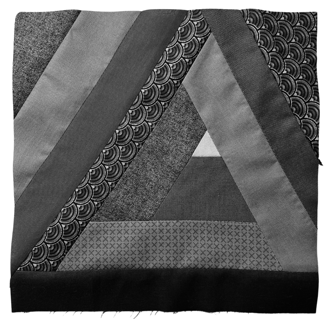
Day 9
Analogous Color Scheme
Assignment: Using fabrics consisting of three adjacent prismatic colors from the color wheel, sew a quilt block.

I continued to use blue-violet as my key color. I pulled out my “Essential Color Card Deck” to find the colors on either side of blue-violet. My scrap bins didn’t offer much variation in value with these colors, so that resulting block is low in contrast.
I built the block in a log cabin method around a triangle of fabric I found in my scraps.
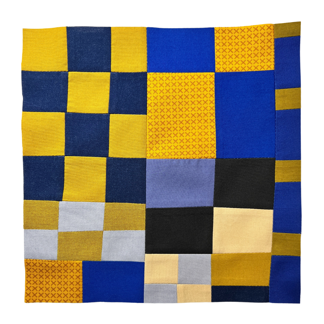
Day 10
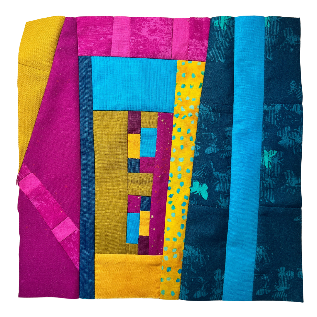
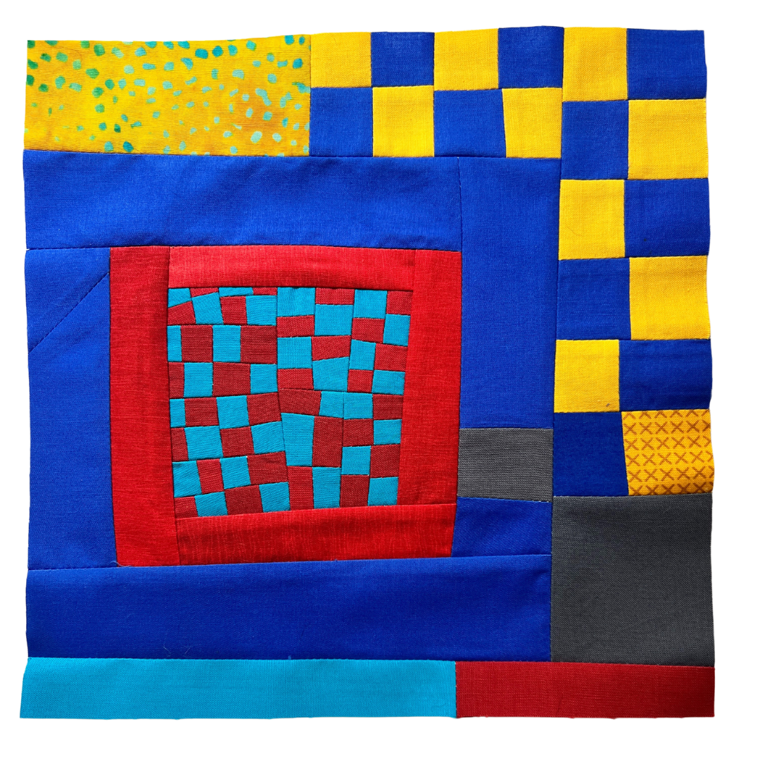
Complementary Color Scheme
Assignment: Using fabrics consisting of two prismatic colors directly opposite of one another on the color wheel, sew a quilt block.

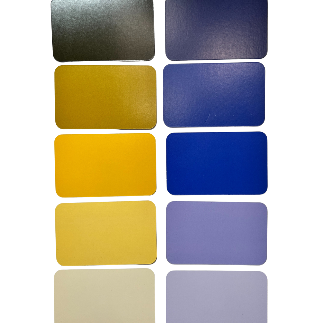
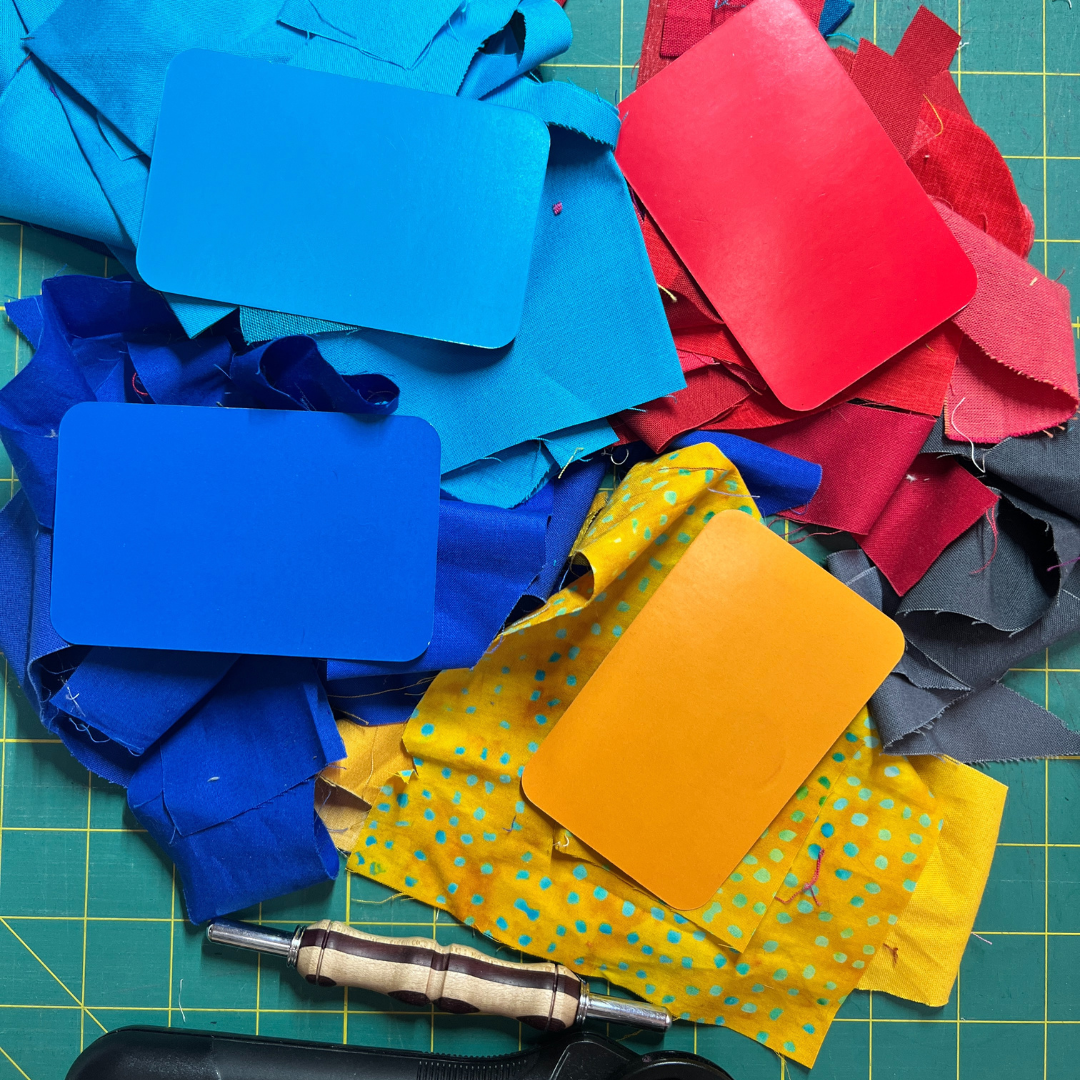
Continuing with the theme from the past few days, I pulled fabric in a range of values for blue-violet and its complementary color: Golden Yellow. I pulled the cards for both of these colors from the “Essential Color Card Deck” so that I could reference them as I pulled fabrics.
The tints and shades give this block good contrast and makes the final block much more bold—and appealing to me. The complementary colors that share the same value tend to look the best together. This confirms the common thinking that complementary colors bring out the best in each other.
Day 11
Triadic Color Scheme
Assignment: Using fabrics consisting of three prismatic hues equidistant from each other on the color wheel, sew a quilt block.

I am a big fan of triadic color schemes, especially cyan, magenta and yellow (often referred to as CMY). It was easy to find fabrics for this color scheme in my scrap bins, which are primarily filled with shades of cyan and magenta. I lean toward shades or tones of yellow instead of pure yellow.
I ended up making two blocks. I started to think about composition after finishing the first block. I’m realizing that it’s hard for me to really get a sense of how the colors interact when I find the composition not visu
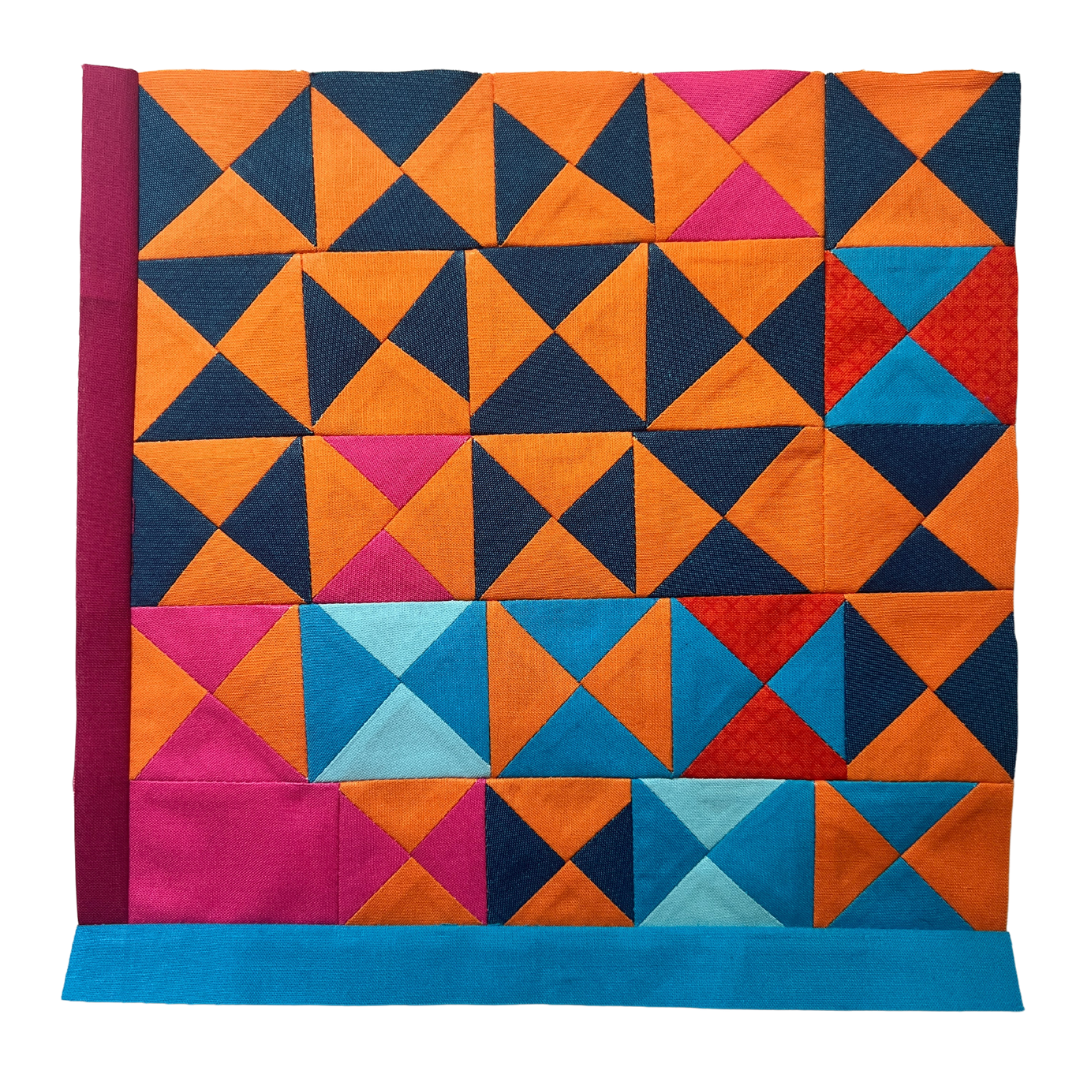
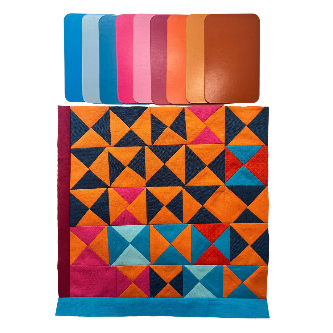
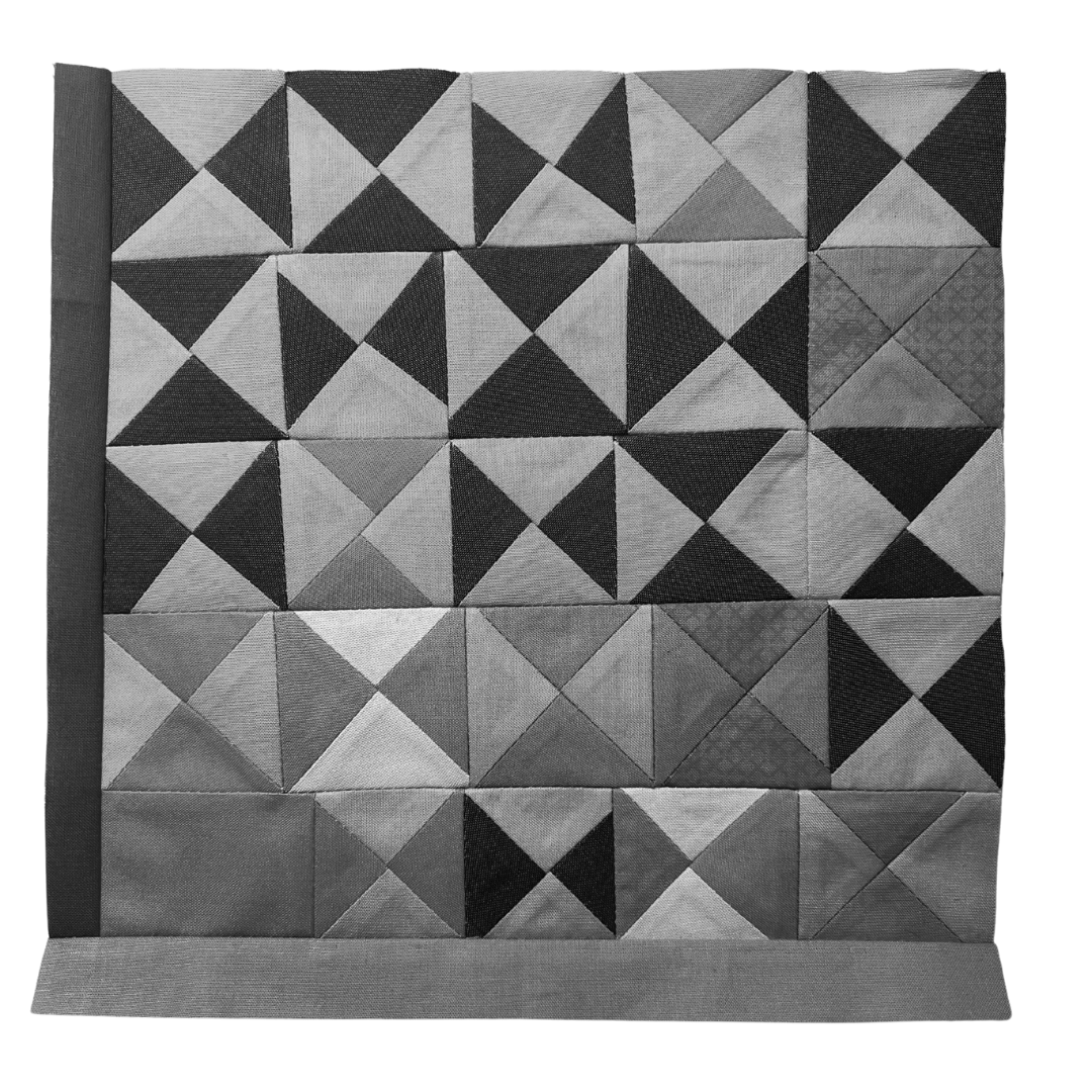
Day 12
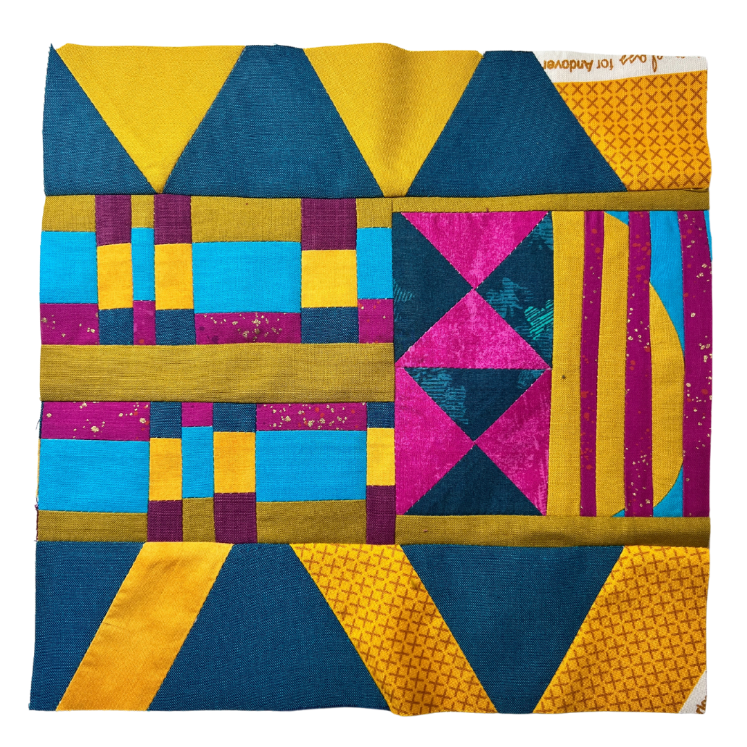
Split-Complementary Color Scheme
Assignment: Using fabrics consisting of three prismatic colors in a split-complementary color scheme, sew a quilt block.

The high saturation of the orange and its lighter value make it come to the front. Then, on further viewing, the dark aqua-blue seems to pop out. It’s definitely contrast that is at play here. The lightest value fabric, the pale aqua-blue also stands out, while the pink blends in.
I do really like this color scheme. It’s lively like the sun and in a clear blue sky. And, I’m a big fan of the the hourglass quilt block. Making the hourglass with the no ruler method makes them even more fun and interesting. I could make a whole quilt with these little blocks — but they are really labor intensive. Each hourglass measures approximately 1.75” to 2” square in size.
Day 13
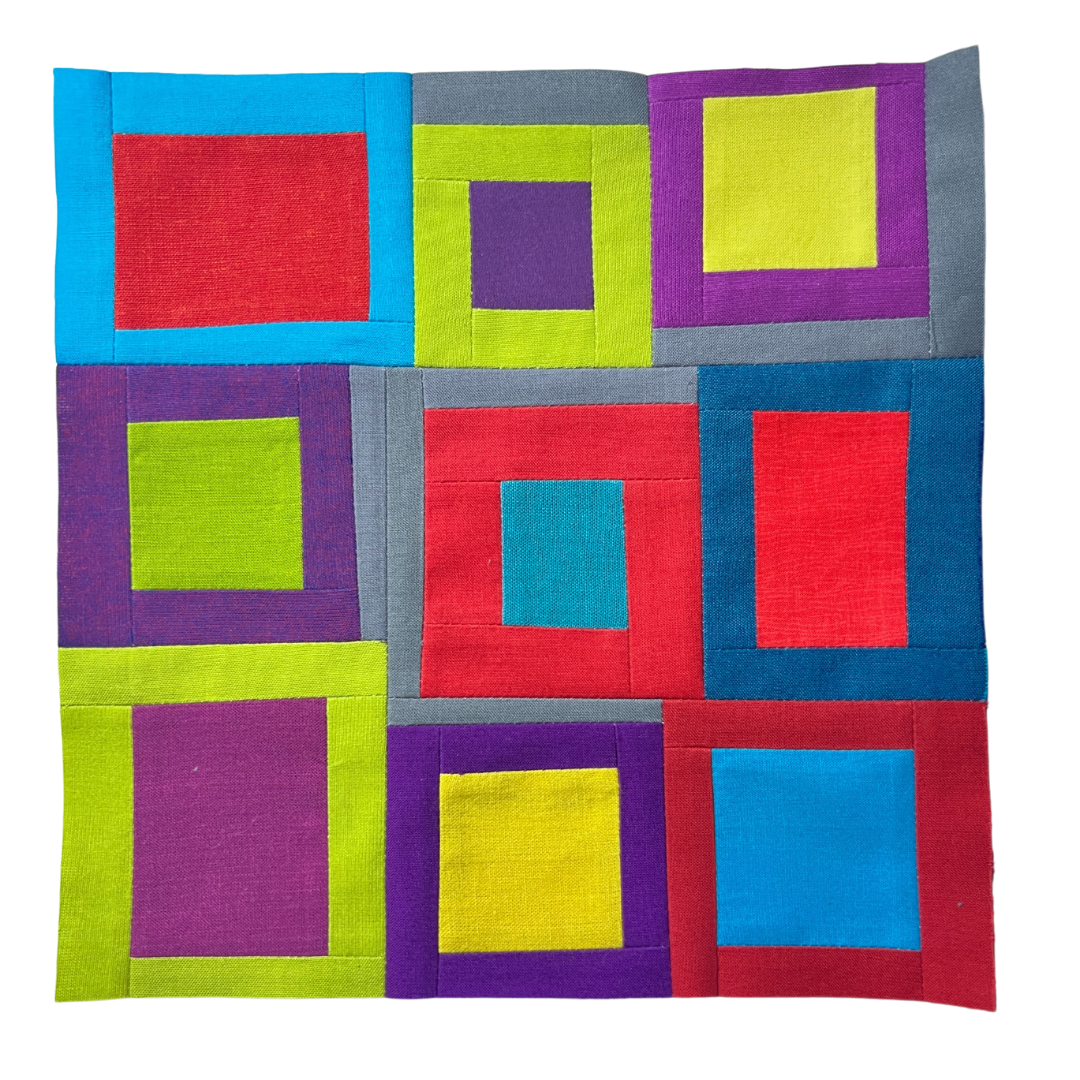
Square Color Scheme
Assignment: Using fabrics consisting of four hues equidistant from each other on the color wheel, sew a quilt block.

This color palette was challenging. I stuck to mostly fully saturated colors because that was pretty much all I had in my fabric scrap bin. I started by making some two color subunits, with one color wrapping around the other. Once I had enough of these subunits, I started to move them around my cutting mat to try to figure out a layout. The colors clashed so much (to my eyes) that it was hard for me to figure out how to make them play nice with each other.
I finally decided to add some gray to the block, just to break up the colors and give the eyes a rest. This also seemed to help the quilt block feel more cohesive. I just realized looking at the block now, that the subunits form a spiral.
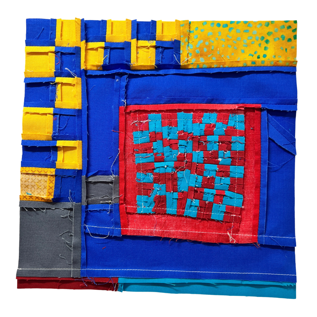
Day 14
Tetradic Color Scheme
Assignment: Using fabrics consisting of two sets of complementary hues, sew a quilt block.

I adore the aqua blue and orange-red bits in the center of this block. Complementary colors make each other shine. You get the best of the color when it’s sitting next to its complement. Those small bits in complementary colors are so vibrant and alive that they almost vibrate.
Like yesterday’s block in a square color scheme, I had a little trouble figuring out how to get these colors to play nicely together. This would be easier if I had added some different saturation levels, but my fabric scrap bins don’t offer many tonal colors. Again, the addition of gray gives the eyes a place to rest and grounds the design, making it feel more cohesive.
Join me for Week 3: Color Proportion in Quilt Design